
Ukrainian giants Shakhtar Donetsk recently revealed their home and away kits for the upcoming 2026/27 footballing season. The club’s jersey manufacturers, Puma, came up with special renditions to mark the 90th anniversary of the club, in celebration of their foundation in May 1936.
The primary kit follows the traditional orange and white striped patterns, along with their rehular oval emblem. However, an innovative design for the away counterpart has had even seasoned fans mistake the shirt for that of English club West Ham United.
The Shakhtar away kit is set to feature sky blue as the base colour for the very first time. The pastel shade is accompanied by burgundy accents along the collar, sides, and sleeve cuffs. The Puma logo and sponsors are also present in the same hue to strengthen the jersey’s duotone characteristic.
For starters, the burgundy and light blue colours have for long been West Ham’s primary choice for their home kits. In fact, just two years ago their jersey featured a maroon shade with blue sleeves and crest.
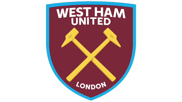
But what makes comparisons of the Shakhtar away jersey with West Ham truly undeniable is the minimalist crest. It features two hammers slanted across each other, strikingly similar to the West Ham club logo.
West Ham fans were quick to point out the similarities online, even expressing a desire to adopt the gorgeous design for their club.
Shakhtar's away kit is giving … Irons pic.twitter.com/evnHqxmLGn
— Central (@WestHam_Central) July 2, 2026
Shakhtar Donetsk Away Shirt if i had the money i would be all over that pic.twitter.com/XtQK99a0pj
— x west ham united nostalgia page boleyn badges (@boleynbadges) July 3, 2026
Shakhtar's away kit is very West Ham 😂⚒️#whufc pic.twitter.com/BjgX6o72fC
— Championship Terrace Talk (@ChampionshpTalk) July 3, 2026
The hammers have been an ever-present feature in the West Ham crest since the club came into being. In fact, their latest design introduced in 2015 even did away with the background towers that featured in the previous renditions, making the hammers the sole emblem of the club.
Shakhtar’s adoption of the hammers came much later. The tools first featured in their crest in 1960 but made way in 1989. In 2007, a new design reintroduced the hammers, albeit as a smaller secondary emblem. This design continues to be the one used by the club at present.
The surprise factor of the coincidence fades away once you delve into the history of the institutions. Both the clubs were born from labour backgrounds and meant to represent the working class.
Shakhtar Donetsk began as an association of club miners under the label Stakhanovets. The name derives from the Stakhanovite movement in Soviet Russia, which meant to increase labour productivity to boost the economy.
The club has stated that their hammers crest on the away jersey is meant to be a tribute to these roots. In fact, the club’s current name Shakhtar also translates to underground coal miners.
As for West Ham, the club was instituted as the works team of the Thames Ironworks and Shipbuilding Company in 1895. It was not until five years later that the club dissolved and reincarnated as West Ham, named after the London district where they were based.
However, the club still wanted to stay true to their shipbuilding roots. Given the rivet hammers were an integral tool in the industry, they were fittingly chosen to be the club logo.
Shakhtar may have emulated the Hammers in presentation but would hope to avoid the same on the field. While they finished as the 2025/26 Ukrainian champions by a massive 12 points and secured qualification to the UEFA Champions League, West Ham endured relegation to the Championship. Only time will tell whether Shakhtar’s performances can match the boldness of their jersey design.