For the better part of their success in the top flight of English football, Manchester City’s kits have been produced by German manufacturers, Puma.
Out of the ‘Big 3’ of the sportswear manufacturers, Nike, Adidas and Puma, the latter has always been informally termed as ‘the third sister’, in regards to the huge difference between the financial evaluation of Puma ($3B-$4B) compared to Nike ($90B-$110B) and Adidas ($30B-$40B).
In the world of football, Manchester City, Borussia Dortmund, AC Milan and new addition Portugal are some of the biggest names that are represented by the second-biggest sportswear brand in Germany.
In recent years, Puma has invited a lot of backlash towards themselves with their ‘different’ designs for football kits. Their different approach to football kits was particularly noticeable in the 2021/22 season’s third kits which featured the name of the club in between two horizontal lines in the high centre of the kit. The design was slated online by fans due to its lack of a traditional singular club logo. It was supplied to Manchester City and AC Milan as their third kits and Borussia Dortmund for their special edition domestic cup kits.
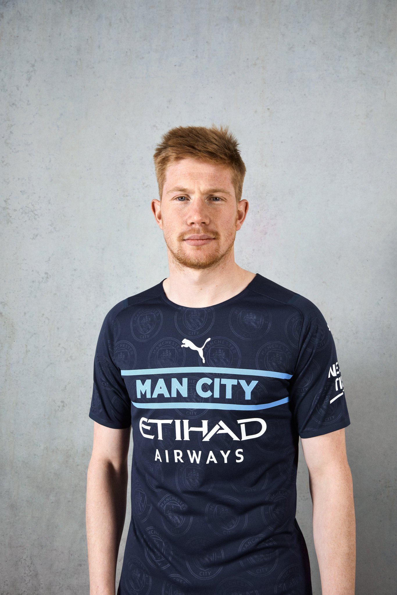
Manchester City’s fans have been left disappointed almost every season due to their disapproval of at least one of their three kits. To this day, many fans continue to criticize Puma for their lack of creativity and claim that the 2023 treble winners should end their six-year partnership with the German manufacturers.
Their newly released third kit for the 2025/26 season has also been massively criticised by fans and rivals alike in what was meant to be a ‘tribute to the Mancunian weather’, but ended up being labelled as the worst kit of this season.
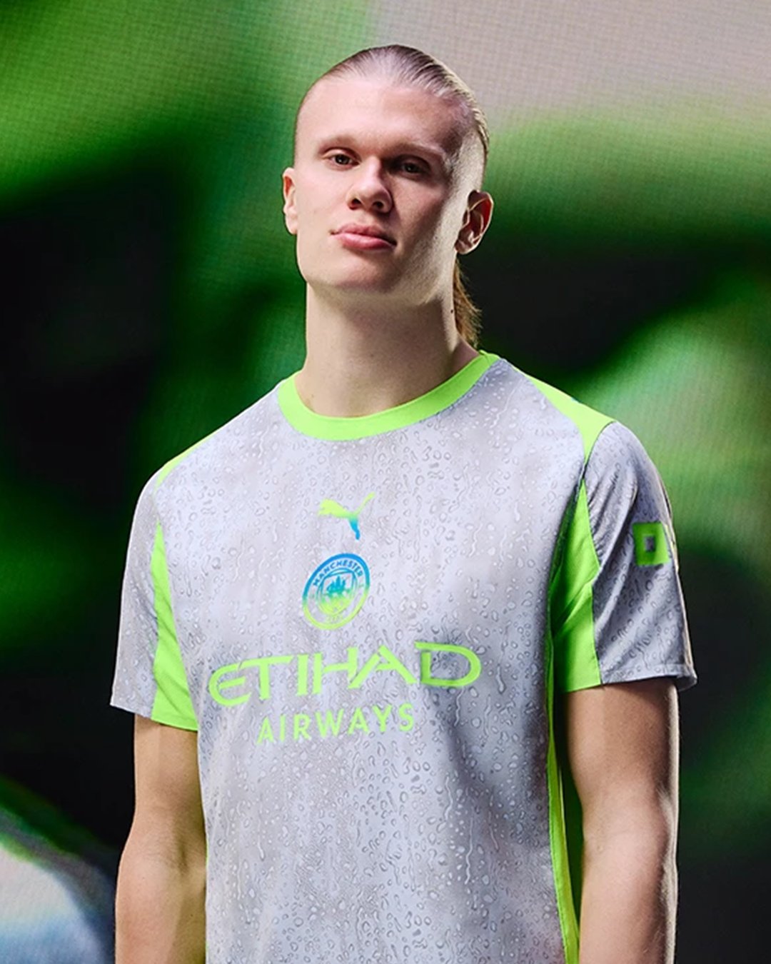
But there was a time when Manchester City were renowned for their impressive kits.
In the late 90s, the Citizens had a brief spell with Italian manufacturers, Kappa, from 1997-1999, during their time in the EFL Championship and EFL League One.
Fans still reminisce about those days, especially due to the creative Kappa stripes design across the shoulders on the kits. To this day, the 1997-98 home kit remains one of the most highly commended kits in the history of their club.
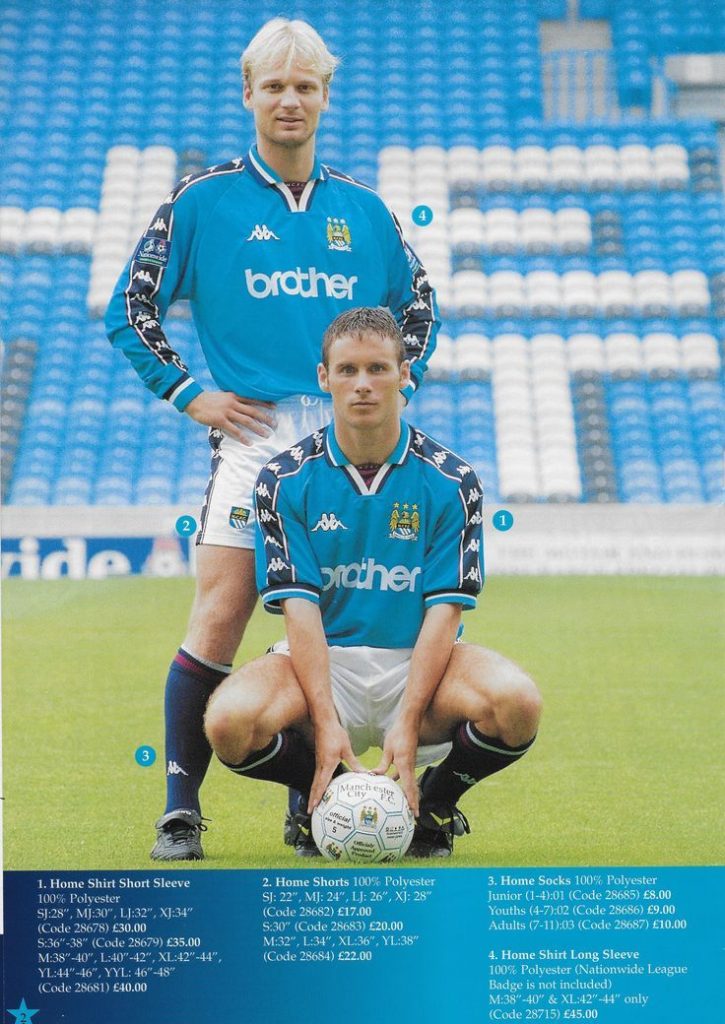
Although the then Maine Road residents were relegated from the Championship to League One in that season, their home kit is still regarded as one of the best vintage shirts in Manchester City’s history.
Kappa still remains a huge kit supplier in the footballing world, currently sponsoring Championnat National’s FC Versailles, who released a pair of special edition kits featuring a gold primary colour combined with the signature Kappa shoulder stripes across the width of the jersey.

Eagle-eyed fans online quickly created a concept for a potential Manchester City kit supplied by Kappa, by replacing the gold colour with their signature blue colour.
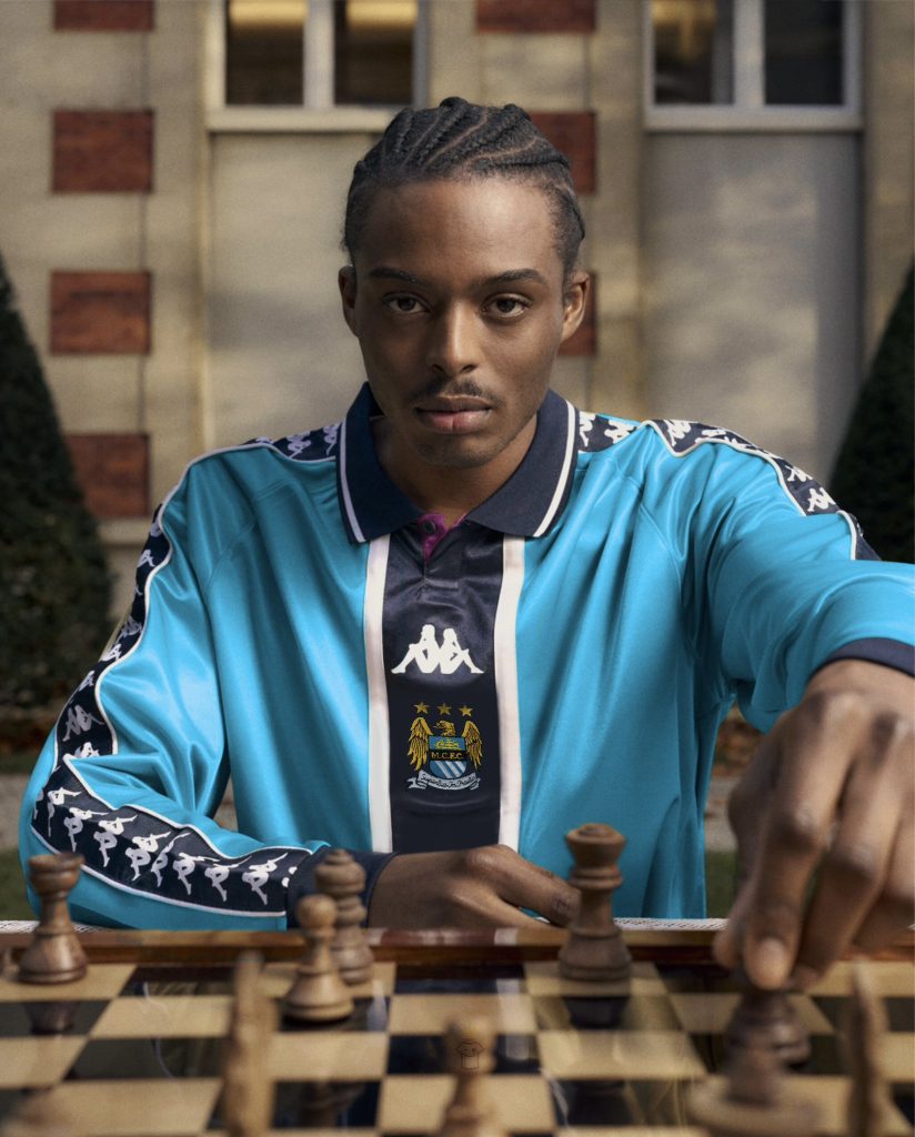
The imagined kit via KitKingdom on X features a clean collar with the iconic ‘Kappa Blue’ as the primary colour that the Citizens had during their previous tenure with the Italians, along with a Kappa logo accompanied by the original Manchester City logo in the centre of the kit.
The concept design struck well with football fans online with many ready to welcome Kappa back to the blue half of Manchester with open arms.
Not quite City fan, but I genuinely think one of the best concept kits I’ve seen in a long time. Good work
Never thought about this! Kappa is my favourite brand and them linking back with Man City would be great for football
really needed that kit, puma are sh*te when it comes to City shirts
What do you think about this concept and should Manchester City go back to Kappa? Let us know in the comments below.