Despite being an American company, Nike has been producing disappointing USMNT kits for years now, and the recently leaked home kit looks all set to follow suit.
The sportswear giant has had a rocky relationship with USMNT fans for the past few years, owing to the poorly received kits they seem to have a knack for dropping.
Take last year’s strip for instance, which was deemed to be underwhelming by almost everybody.
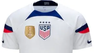
For America’s long-awaited return to the World Cup, Nike produced a plain, uninspired kit that failed to stand out in Qatar.
It featured a reference to the American flag on the sleeves, alongside an NFL-like collar and logo alignment.
The rest of the shirt was entirely white and so were the shorts, which made for a bland look.
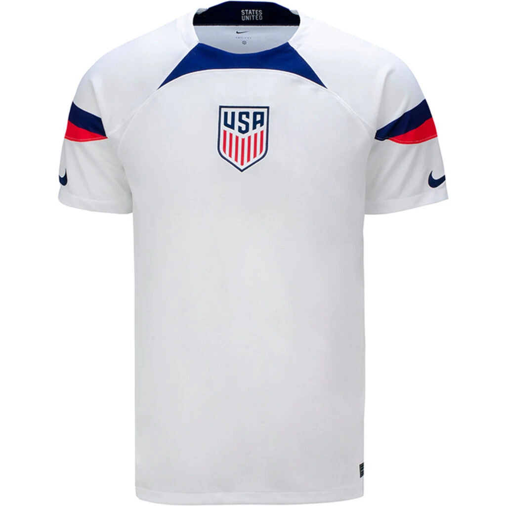
Naturally, Nike was panned by fans online for the kit, and even Weston McKennie expressed his dislike for it.
Nevertheless, the brand has a chance to redeem itself this year, especially with the FIFA Women’s World Cup beginning in June.
And as per the recurring trend, the women’s kit will be shared by the USMNT for their International fixtures.
The 2023 USMNT kit
The kit arrives courtesy of Footy Headlines, and it can be seen in this accurate render.
Going by the images, the US national kit will be deviating from the design patterns we’ve seen in previous years.
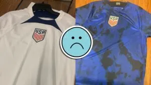
Nike looks to have opted for a spotted look with splashes of paint all across the base of the shirt.
These blue splashes are present on a predominantly white base, and their reach also covers the sleeves. The individual spots do differ in color, as some appear to be darker than others.
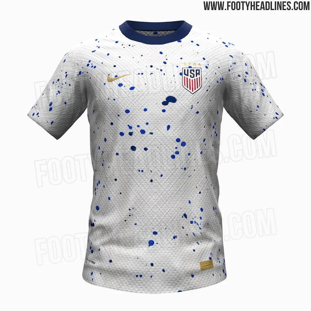
Unlike the USMNT World Cup kit, Nike looks to be doing this one justice, as it features golden accents highlighting the USWNT’s prestige.
The Nike swoosh appears in Gold, and the National crest has 4 golden stars above it, representing the team’s 4 World Cup triumphs.
While the added golden flavor lends a bit of flair to the overall look, the core design itself is rather bizarre.
The blotches of paint don’t make much sense for the American national kit, and they certainly aren’t referencing the flag. Without the golden touch, the graphic falls flat, and its peculiar nature stands out even more.
Why are they stuck on producing the most hideous jerseys. It literally looks like a paint splatter every time
— vv (@PaddyMacSwag) March 16, 2023
This would be a cool training shirt. I do like it. It’s just not very American. It doesn’t have the class that I expect from a national team kit
— Chris (@back_up10) March 18, 2023
Just as lazy as the last one lmao
— MataGooner 🌵🏴☠️ (@MataGooner) March 16, 2023
Wow. That’s effing terrible. But what else is new?
— Matthew (@ChelseaMatt33) March 16, 2023
We have such a unique, attractive flag. There are SO many things they could do with its design elements. Yet they are hung up on tropes from 80's breakdancing movies…
— Geoff vanMaarten (@GeoffMaarten) March 17, 2023
It’s hard to imagine that the graphic required a lot of thought, for all we know, it could’ve been the work of a faulty printer.
The USMNT version will probably be without the 4 stars as well, which instantly snatches away the aforementioned ‘prestige’.
Fans online appeared to be similarly unimpressed with the kit, with many taking issue with the ‘lazy’ graphic. Others took a sigh of relief since this leak was at least better than 2022’s bore fest.

