We’ve seen some absolute howlers be served up as official kits over the years. And with that said, we’ve got to admit that this newly leaked Fulham kit is a special kind of awful.
The Lilywhites are currently enjoying a solid campaign, which has them defy and go beyond the expectations placed upon them.
The London outfit returned to the Prem after winning the Championship last season. And while some were betting on them to drop back down, Fulham have instead climbed their way to the top half of the table.
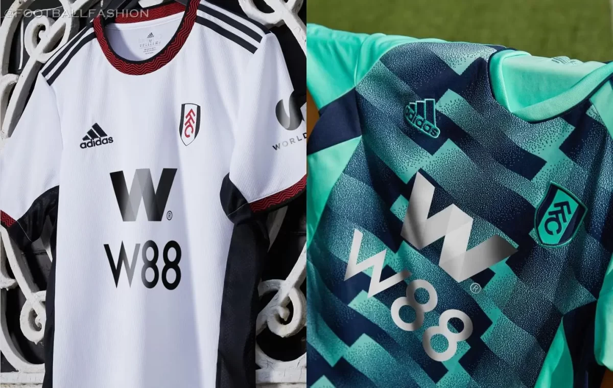
In terms of their threads, The Cottagers have been sporting two distinct Adidas-designed strips this season.
While the home kit offered up another iteration of the traditional black-and-white affair, the away kit took some liberties and delivered a teal shirt with a rather eye-catching graphic.
With Fulham having extended their stay in England’s top flight, they certainly deserve a new kit reflective of their status as a Premier League club.
But based on this premature leak, the club are likely to receive a kit that screams 7 pm kick-offs at Stoke.
Shocking Fulham away kit for the 2023/24 season
As mentioned before, the kit is designed by German Sportswear giants Adidas. The leak comes via a report from Footy Headlines.
At its core, the strip appears to be strictly traditional, with heavy usage of white and black.
As seen in this image, the kit features white for the base, and black for the accents, which also envelopes both sleeves entirely.
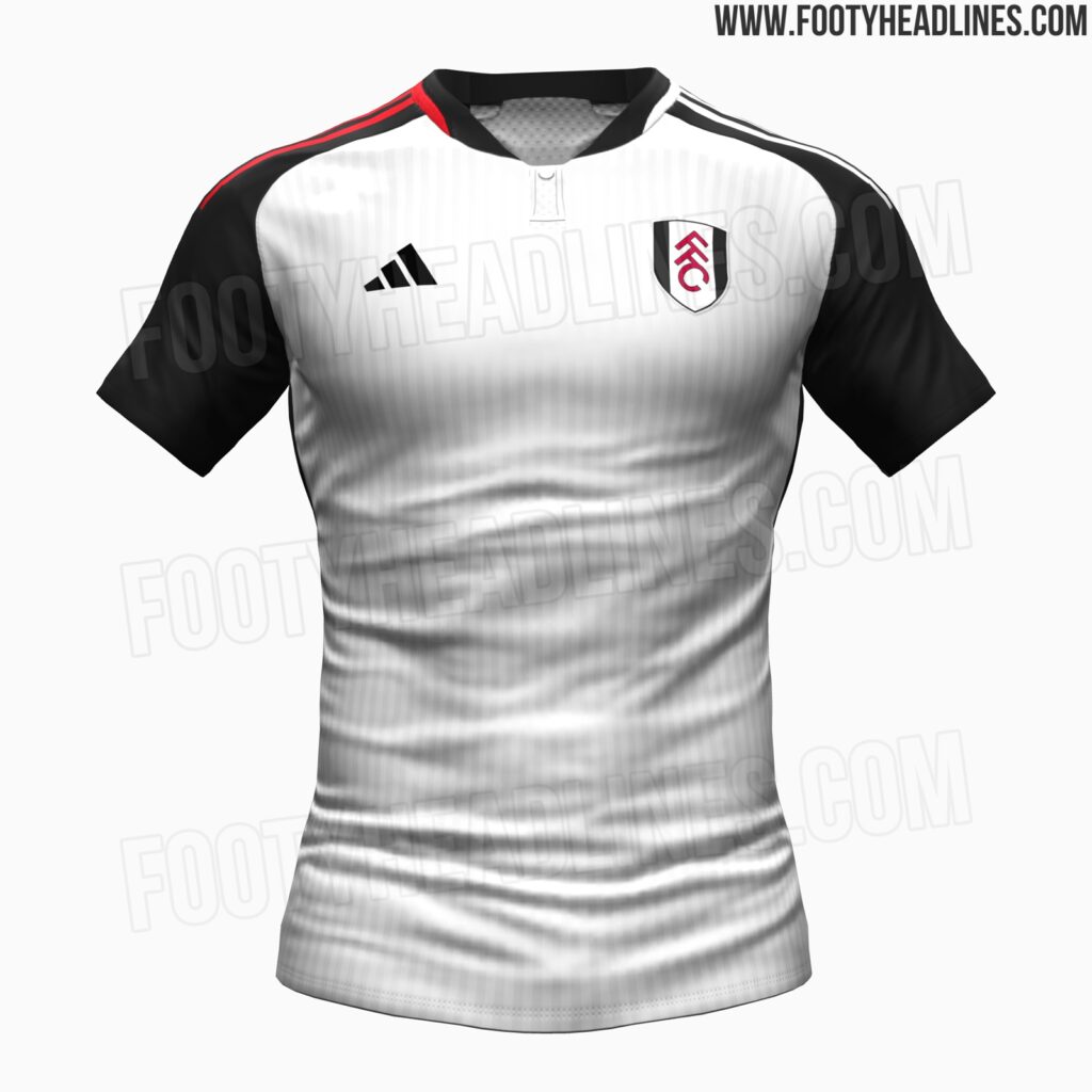
The base appears to have a pinstripe pattern running on it, although it is quite subtle in nature. Black is used for the various logos, including the new trimmed-down Adidas logo.
There also looks to be a theme at play, as spotted on the Three Stripes present on the shoulders.
While one side has red-colored stripes, the other features the color white. This half-and-half theme also extends to another key part of the ensemble: the shorts.
Usually, it’s the shirt that serves as the highlight of the kit, but in this case, the shorts take the cake, but sadly for the wrong reasons.
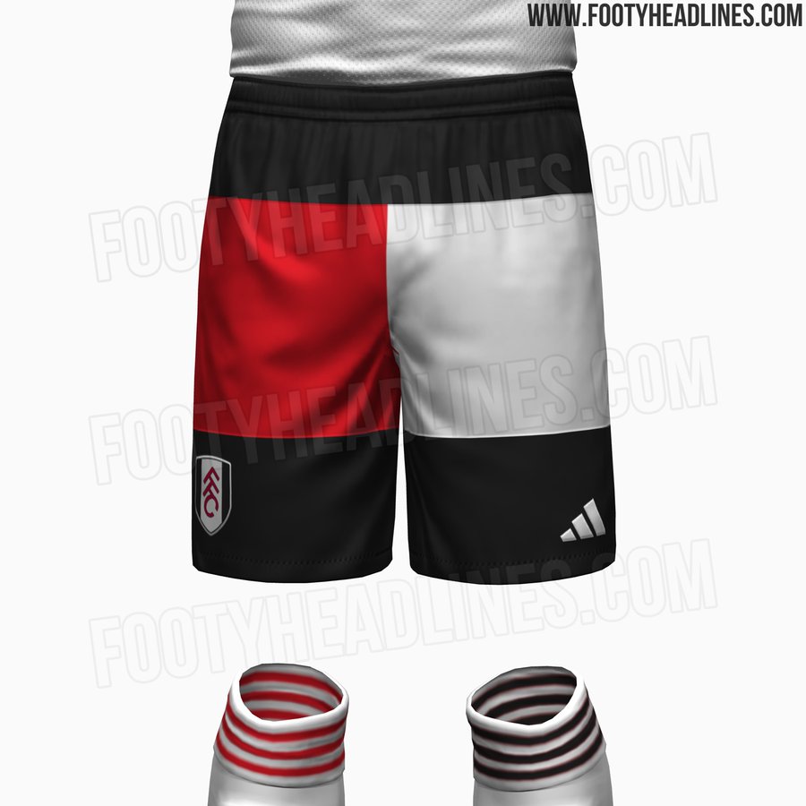
In line with the design template, the shorts display a half-and-half approach, as red colors the left-sided panel with white filling out the other.
Normally, we’re all for a bit of creativity in kit designs, but this spin on the shorts doesn’t quite hit the mark.
Instead of gelling with the theme, the multi-colored shorts just seem out of place. In fact, we can’t even imagine the possibility of it looking decent on the players.
A majority of fans online shared our dislike of the overall look, and some even compared the red/white split to the Tommy Hilfiger logo.
Adidas would’ve likely had a winner with the shirt itself, and although it’s unlikely, perhaps they should consider binning the shorts entirely.