Very few clubs can match a cult status in European football like AC Milan. The seven times Champions League winner is not just a successful club but one of Italy’s priced possessions. AC Milan has been meddling through some sporting issues recently but what is bothering the fans is the launch of their third kit and one can’t complain.
Club legend, Paolo Maldini’s sacking was shocking, considering that it was during his time as sports director of Milan, the club performed well, winning one Scudetto, and reaching the semis, with way less money compared to PL clubs and La Liga giants.
On top of that selling Sandro Tonali, often regarded as Pirlo’s heir, to Newcastle United for 70 million was questionable as he was seen as a true Rossoneri by heart. All of these events created an air of negativity among Milan fans, but Milan has cashed the 70 million and has strengthened their attack by signing players like Pulisic, Loftus-Cheek, Samuel Chukwueze, Tijjani Reijnders, Noah Okafor, bringing back some much-needed optimism.
However, the optimism has been tampered with again and it’s their Kit and its designers who are guilty. It’s not that simple, there is a little dichotomy in this Kit. A dichotomy between “What” and “Wow”. Wow when you look at the front side of the Kit, what when you look at the back.

Rafael Leao, Theo Hernandez, and Ismael Bennacer appeared in the kit unveiling and posed wearing it. The front view is vibrant and colorful, an amalgamation of pink, purple, and blue, giving a somewhat Barbie-esque vibe, how third kits are supposed to be.
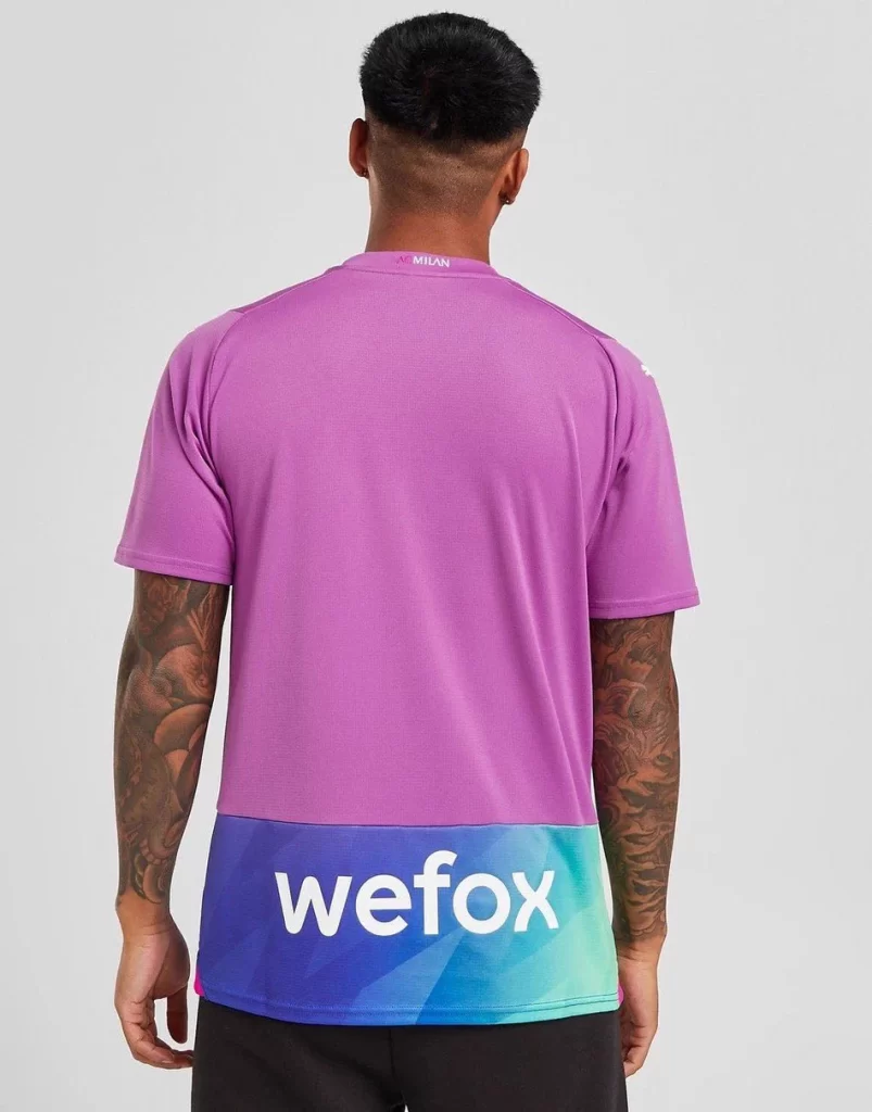
However, the back feels like it has been designed by some class 4 kid with MS Paints. Pink at the top and then suddenly blue with WEFOX written on it, it feels like a fake PUMA design bought from a secondhand market.
The flow of colors is also very stagnated in the backside. Whereas in the front, the three different colors as mentioned above mix smoothly with itself, which is very pleasing to the eye. However, the back is plain pink and plain blue divided unequally, and quintessential example of a design failure. Surely it is giving Milan fans mixed feelings.
Casper Stylsvig, Chief Revenue Officer of AC Milan said, “This Third kit is more than just a football jersey. It truly stands as a symbol of inclusion, celebrating the power of diversity with its unique design and colors.
“We are proud to launch this kit with our long-standing partner PUMA and to provide our fans with a fantastic looking jersey, which does not just allow them to show support for their favorite team, but also to make them feel proud of their identity.”
Milan fans seem to be a little touchy about their iconic kit. The 2016/17 away kit which gave a Real Madrid vibe didn’t go well with fans as they saw the club deviating from their traditional colors and patterns.
Milan fans aren’t that sad either, as third kits aren’t used that often, not that this kit is absolutely bad but confusing, to say the least. It is to be seen what memories this shirt will carry at the San Siro, if positive, the back design failure may be overlooked, and the kit will be embraced in its full capacity.