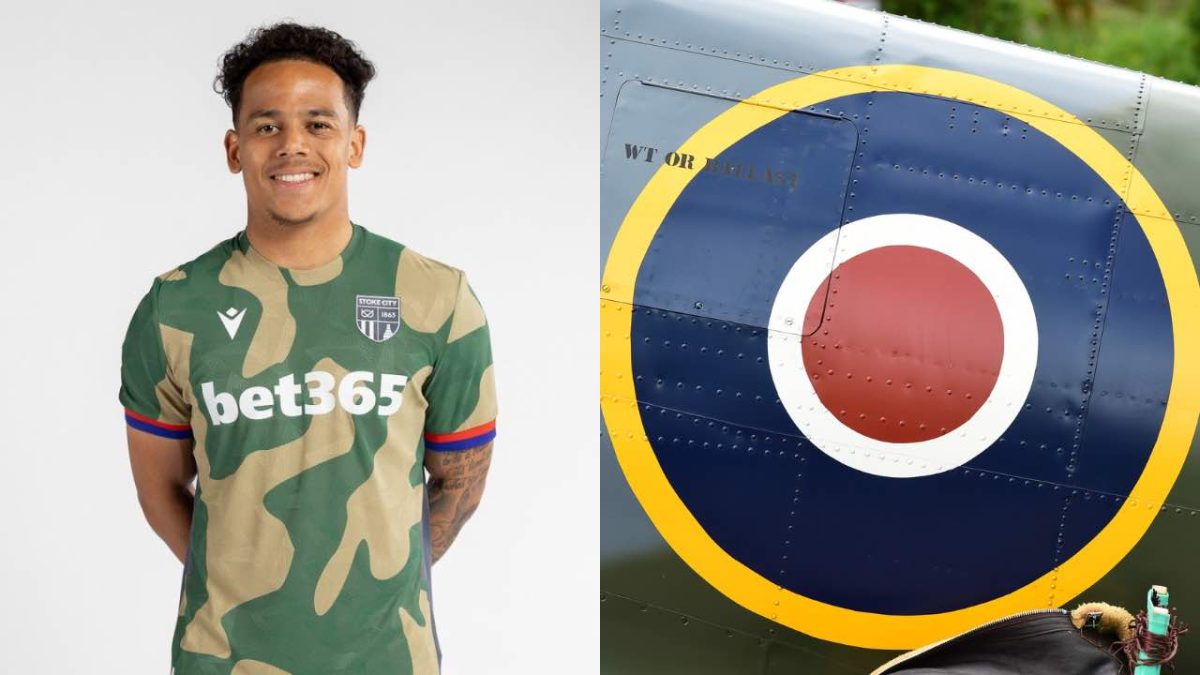
Stoke City on Friday revealed their away kit for the 2026/27 English football season.
The Championship club’s kit-manufacturer Macron delivered a unique design to commemorate Stoke’s contribution to the nation.
The jersey boasts a loud camo-design represented by alternating vivid green and dull brown patches. Both Macron’s and shirt sponsor bet365’s logos are whitewashed.
Stoke’s own crest, meanwhile, is presented in a striking black-and-white duotone, made using innovative thermoplastic technology.
Adding great oomph to the design are vibrant red and blue stripes along the sleeve cuffs.
All these elements are far from random, tied together wonderfully by a piece of Stoke history.
Founded in 1863, the club derives its name from the Stoke-on-Trent settlement in Staffordshire.
62 years had passed from their establishment when Stoke was finally awarded city status, at which point the club changed its name to Stoke City in 1925.
Not long after, a Stoke-resident would change the complexion of military warfare and become the inspiration behind the 2026/27 away jersey.
Reginald Joseph Mitchell CBE, raised in Stoke’s Butt Lane, became an aircraft designer and began working for Southampton aviation company Supermarine.
In the early 1930s, Mitchell would introduce the British forces to the Spitfire, a revolutionary World War II aircraft.
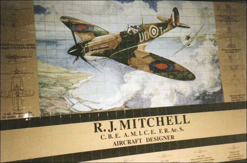
Powered by Rolls Royce, the aircraft’s trademark thin wings reduced drag drastically, while still having the capacity to hold fuel and armament.
The original Supermarine Spitfire boasted camouflage colours, the reference behind Stokes’ latest jersey.
The red and blue accents are a tribute to the Royal Air Force (RAF) emblem that featured on the wings and sidebody of the Spitfire.

In fact, Stoke have gone one step further to make the tribute explicit.
While they will wear the regular editions on matchdays to honour the Football Association’s jersey regulations, retail editions for the fans will carry some special cooperative details.
These include an ‘RM / Spitfire’ inscription on the nape of the neck, which also features small red and blue knittings.

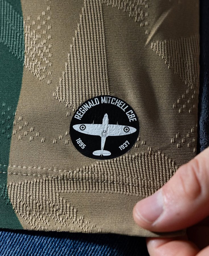
On the sleeve, an authentic Spitfire insignia will carry the outline of the aircraft along with the text ‘Reginald Mitchell CBE (1895-1937)’.
However, a section of the fans found the heavy military inspiration particularly worrying. The horrors of war in the 20th century led to a huge global counter culture movement pushing for pacifism, and the jersey could be seen as one belong to an era gone by.
Some even used the camouflage motif as a means of trolling, given Stoke City’s ‘ streak of midtable finishes in the Championship over the last few years.
“Camouflage! The players could hardly find each other last year!! Reminds me of my Action Man figure in the 70s! Don’t care tbh as long as we win more matches this season!“
A pragmatic summed up the discussion perfectly on X. The war-inspired jersey can carry ungainly connotations when worn by adults, but the boldness of the design itself is certain to make noise amongst the younger crowd.
“Can see it being popular with the kids but not for me, bit disappointing.”
The back of the jersey came under particular fire, given it discontinues the camouflage pattern. Instead, there is a large dark grey homogenous panel to allow greater visibility for player names and numbers.
“I’m really conflicted by this kit; I love the idea of Stoke paying tribute to RJ Mitchell & the Spitfire BUT that grey panel on the back AND the grey shorts with camo inserts are ‘a bit of a challenge’ visually. If they’d have just gone with green it would’ve been better imo.“
A Saints fan noted the back panel is becoming a pattern in the second tier of English football, where Southampton also ply their trade at present.
“All the away shirt needs is the pattern from the front to be on the back. I hate that @SouthamptonFC insists on not putting full stripes on the back of our home kit.”
Perhaps it helps that expectations from Stoke have declined massively in the ongoing decade, as reflected in a rather cynical comment.
“I don’t know what anyone expected, its a spitfire inspired kit nothing else you can really do tbf”
All said and done, Stoke fans had to come to terms with the hand they’ve been dealt, finding ways to make the kit feel endearing.
“Unpopular opinion maybe but I really like it. I love the inspiration behind it and daring to be different with it. We wear what we want!“
It remains to be seen how the stadium audiences react when Stoke ultimately debut the kit officially. Fittingly, the Potters’ first away game of the season is against Southampton, on August 22 in the Championship.