Much like the kit battle at the Men’s World Cup, Adidas has earned a sizable lead over the competitors through their kits for the upcoming FIFA Women’s World Cup.
The German sportswear brand’s diverse, geographically-inspired designs are best described as eye candy, and fans have eagerly been waiting to see Nike’s efforts at dethroning the Three Stripes.
Fortunately, they have to wait no longer, as the brand has now dropped its Women’s World Cup collection.
With Nike sponsoring 13 national sides at the tournament, you’ll see the iconic check pretty frequently.
And as for the kits themselves: it’s a mixed bag.
England
The Lionesses and current European Champions receive 2 solid strips.
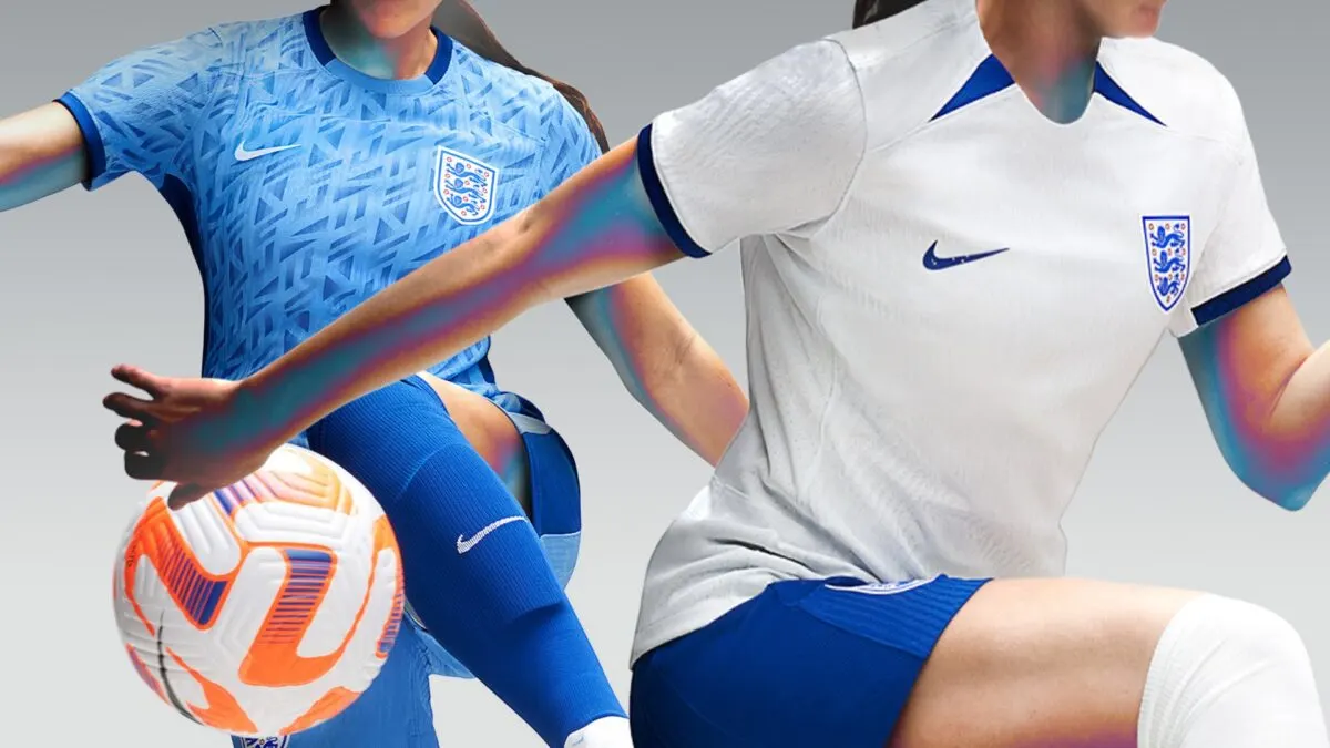
The home kit sticks to the traditional white and features blue trims for the accents, which serve as a homage to the 1984 England Women’s team.
The away strip introduces a bit more flavor, with a marine blue shade for the base alongside a textured, geometric pattern running throughout.
USMNT
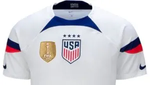
The reigning World Champions’ home kit leaked a while ago, and as mentioned in our coverage, it’s a strange one.
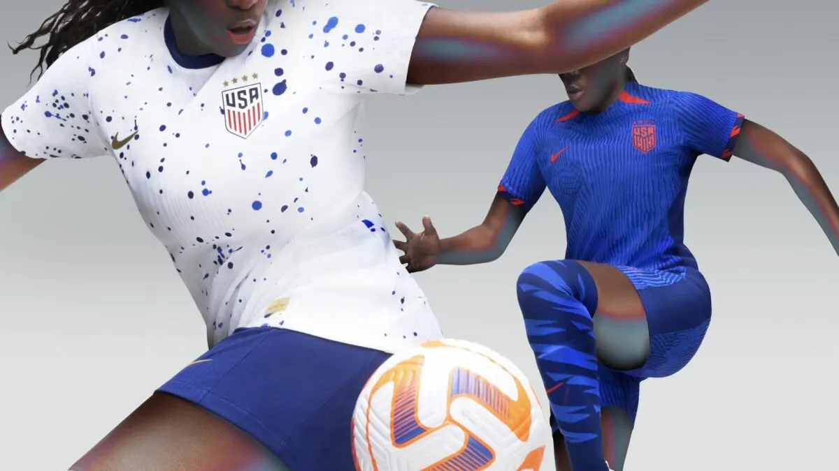
Inspired by the expressionism art movement of the 1940s, the kit features paint splatters on a white base. The graphic is paired with opulent gold accents which blend in quite nicely, making for a decent look.
As for the away kit, the predominant color is dark blue, paired with neon red accents.
A layered graphic envelope the entire shirt, with red flairs on the sleeve cuffs and near the collar providing contrast.
Brazil
Brazil’s home kit requires little deliberation, something Nike have rightly heeded.
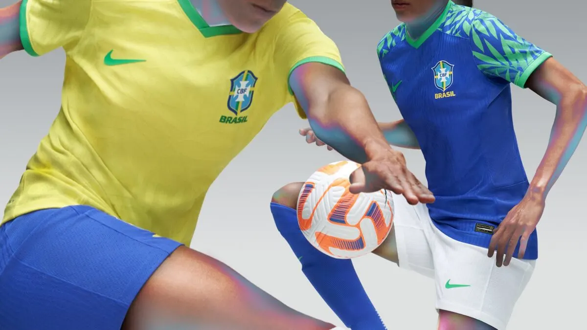
The iconic yellow base and blue shorts return, there also appears to be a faint, foliage-like graphic at the front.
The away strip goes all-blue with green accents for company, and the colors complement each other effectively. A green leaf pattern can be seen on both shoulders, giving off heavy jungle vibes.
France
Les Bleues’ kits draw inspiration from the abstract art movement known as Orphism. As such, they feature recreations of brushstrokes for the graphics, which are executed deftly.
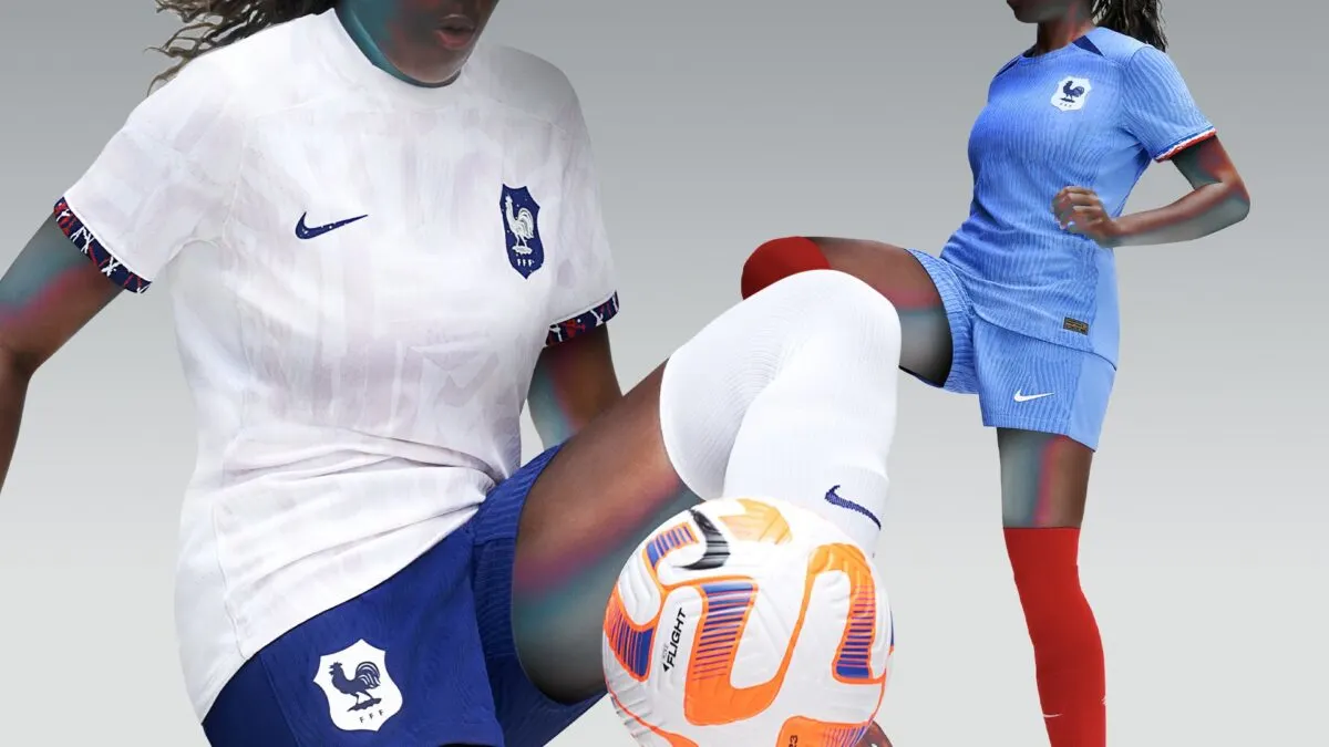
The home kit features a lighter version of the traditional blue, with textured strokes running vertically as the graphic.
The away strip displays a warm white color at the forefront, paired with serene lilac brushstrokes, resulting in a lovely look.
Nigeria
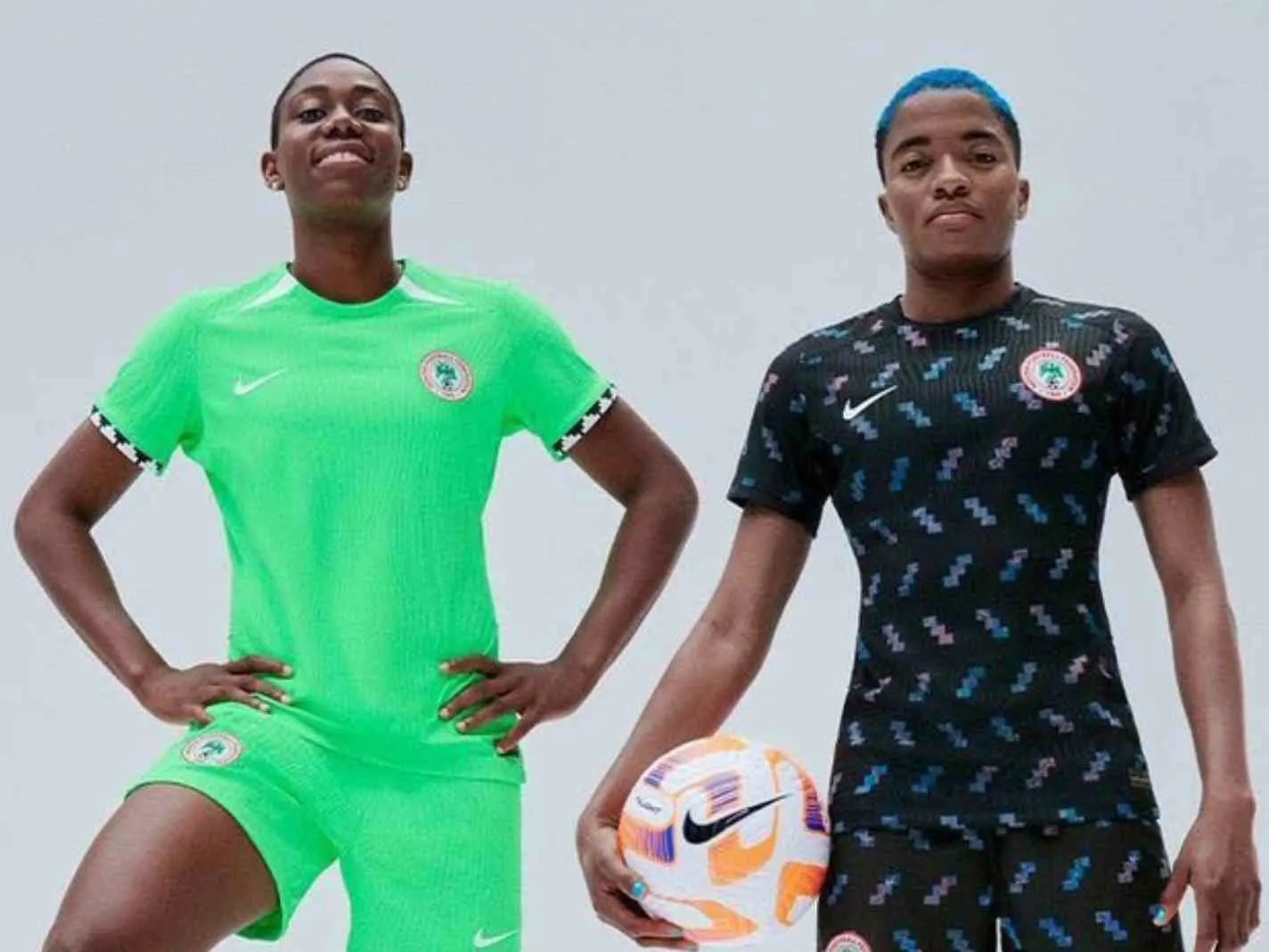
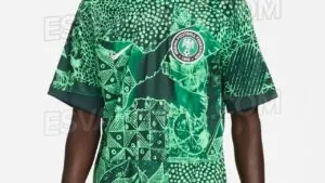
Naija kits usually hit the spot, but we’re sorry to report that this home kit ain’t it.
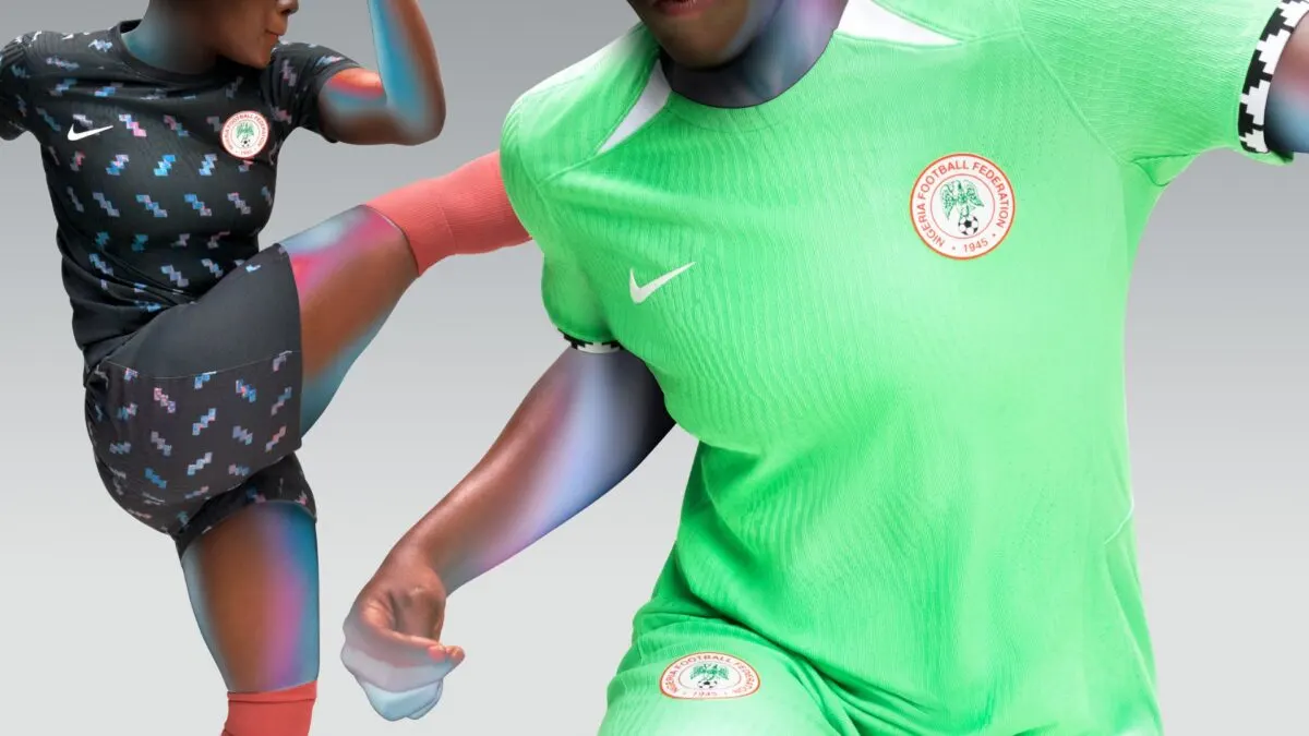
At the base is bright green with woven textures running vertically. The sleeve cuffs feature a bespoke pattern, which is certainly the highlight of the look
In contrast, the away kit delivers as expected, through the use of black as the primary color alongside a multicolored zig-zag graphic.
Australia
Tournament co-hosts receive an eye-catching home kit, as Nike employs the use of gold as the main color, paired with a wavy, marbled pattern.
Dark green accents round off the excellent kit, and sadly, this is where the good news ends for Australia.
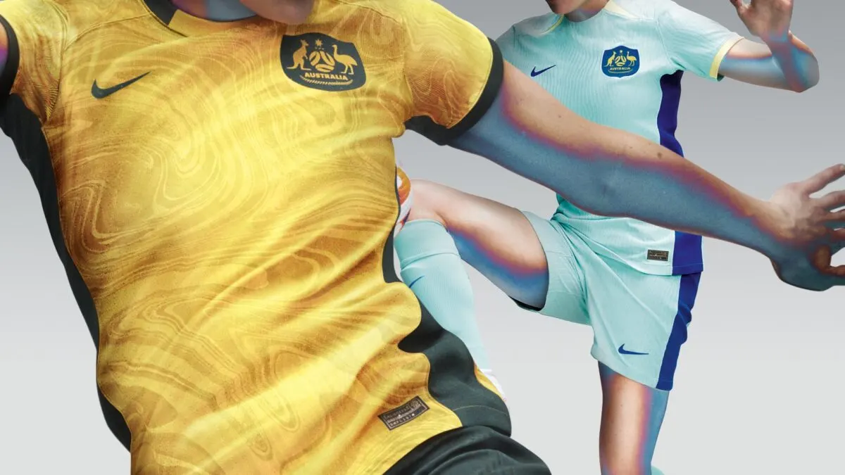
The away strip opts for a tame color combination, as light blue is the dominant color with a darker blue used for the accents. Frankly, it all makes for a drab and uninspired look.
Canada
The Olympic champions get a home kit with a rather futuristic theme.
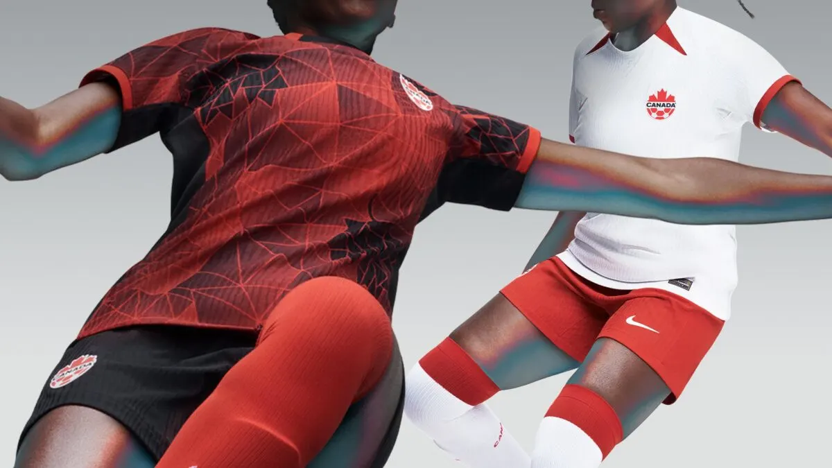
Present on the dark red base is a laser-grid-like graphic, the fragments within represent fractions of the Maple leaf emblem, and they pair excellently with the black shorts.
In comparison, the away kit comes off as extremely plain, it features white for the base and red for the accents. And there is nothing further to add.
South Korea
The South Korean home kit is possibly the most colorful of the lot.
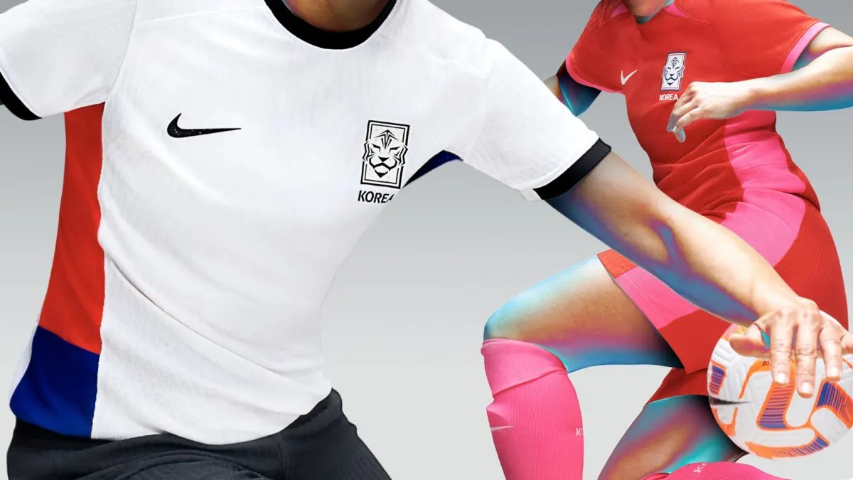
Red envelopes the base while neon pink provides company on the side panels. The kit is set to be paired with neon socks, culminating in a very fun look.
The trend of stripped-back and subpar away kits claims South Korea as well, on offer is a plain white kit with colored flanks representing the national flag.
China
The Asian Champions receive a traditional all-red home kit.
Inspired by the national flag, the shirt features yellow outlines and accents, making for a neat touch.
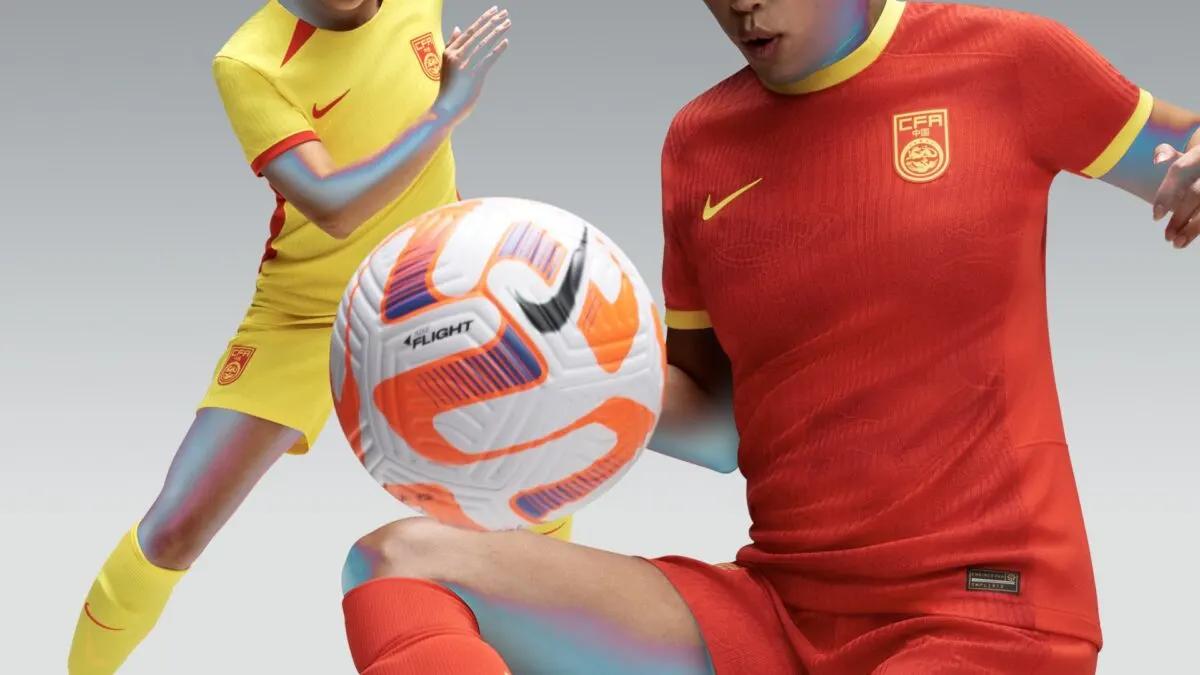
On the other hand, the away kit is as uninspired as it gets. Nike has simply introduced a color switch, which yields a frankly terrible result.
Portugal
The European outfit gets a serviceable home kit. There isn’t much going on, aside from the standard red and dark green affair.
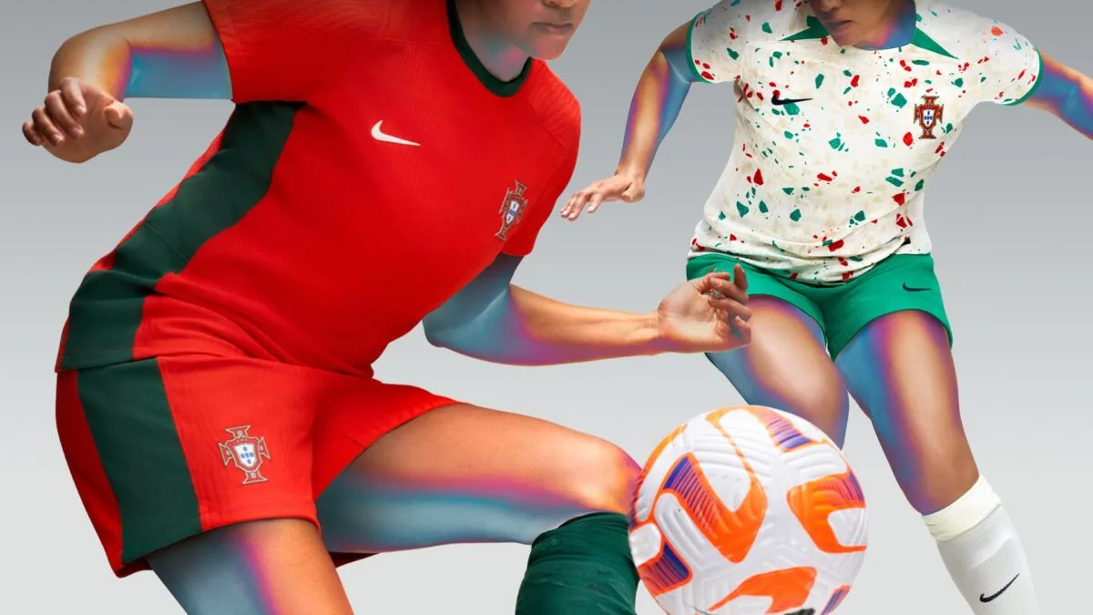
In contrast, the away kit is brimming with creativity, the reason for which lies in the speckled pattern on the base. Reminiscent of confetti, the pattern borrows its colors from the national flag and pairs well with the beige-like base.
Norway
The Scandinavian nation will feel hard done by Nike, as both their kits lie on the mundane side of the spectrum.
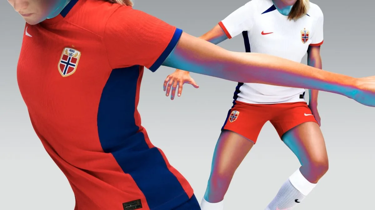
The primary kit featured a red base with blue trims and accents, clearly taking notes for the country’s flag. The away kit simply interchanges these colors, with white also added in for the base.
Netherlands
The Oranje gets a traditional orange home strip, and a waxy texture is present as the graphic, giving the kit a glimmering appearance.
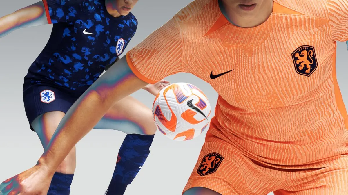
The away kit introduces a darker and sharper look. Dark blue is utilized for the base while a lighter shade of blue is employed for the graphic. Red trims on the sleeve cuffs and the white colored badge add additional flair to the look.
New Zealand
Unlike fellow co-hosts in Australia, the Kiwis do not receive a primary strip to write home about.
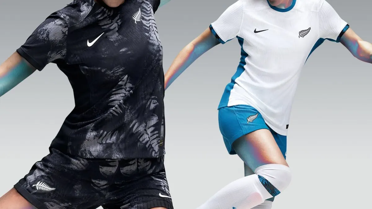
Black is used as the dominant color, with a white fern pattern popping in throughout it. It’s easy to see where Nike got their inspirations from, but the look itself is quite messy.
The away kit fares much better, on display is a white base paired with a bright blue shade for accents and trims. The color combination isn’t incredible in any sense, but it certainly gets the job done.
Overall, Nike’s efforts are, at the very least, commendable.
While the brand hasn’t matched the sheer creativity poured by Adidas into its kits, Nike has managed to produce some attractive kits.

