Has someone cursed Tottenham Hotspur? The Lilywhites haven’t won a single Premier League game yet in 2026. Now they are in a shocking relegation battle with Nottingham Forest and West Ham United.
With Tottenham just a point away from the relegation zone, the chances of them playing in the Championship next year are shockingly high. But as the going is getting tough, Spurs fans have just received the first glimpse of the 26/27 away kit.
No doubt, Tottenham had a great chance to create a 4 point distance between them and the relegation zone on Sunday. They had a six-pointer against Nottingham Forest that they needed to win.
The Tottenham fans showed up in huge numbers on the streets to show support for the team bus. Yet, everything came tumbling down in a tragic fashion for the Lillywhites. They crashed and burned to a humiliating 0-3 defeat against Forest.
Now in 17th position, Tottenham’s unending funk is slowly leading them towards the Championship. For a club as big as Spurs, this could be a disaster of epic proportions.
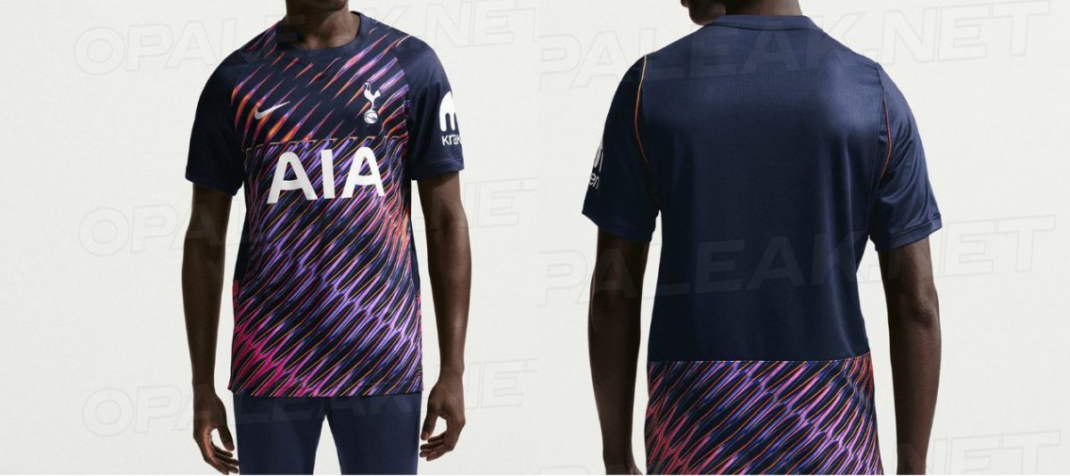
And right when the vibes within the club are bad, we’ve received the first glimpse of their away kit for the next season. It’s not what the fans expected, especially after this year’s popular kit.
Nike has used “obsidian” as the primary base color for the Tottenham 2026 away kit. It’s a special shade of navy blue that has long been a part of Nike’s history. The real USP here, though, is the bold pattern painted across the front of the jersey.
💥 BREAKING 💥
— Opaleak (@opaleak) March 27, 2026
⚡️ OFFICIAL PICS – Tottenham 26/27 Away Kit! pic.twitter.com/4Y4VhiaAYE
There’s a chaotic mix of colors and diagonal lines in this 2026 away kit that strikes all the senses immediately. The neon shades of pink, purple, and orange look like a homage to sci-fi movies.
All the logos and sponsors are given a crisp white color; however, the background tells a different story. Due to strict visibility rules of the Premier League, the back of the shirt is plain in order to accommodate the name and number of the players.
The bold lines return at the bottom of the tshirt but this abrupt change in design makes the back look a little awkward.

Now the reaction to this jersey hasn’t been completely positive. The excessively bold design has come in stark contrast to the highly popular, simplistic away jersey of the present season. Many fans have even called this a great jersey for the Championship, but not the Premier League.
Their words might turn true if Tottenham doesn’t find its form soon. Spurs is set to face off against Sunderland on April 12.