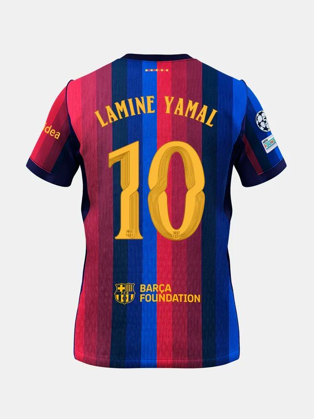
Barcelona FC are set to have a brand-new custom typeface for the 2026/27 kits called ‘FC Barcelona Modernista’. After seven years, the club has decided to move away from the blocky typography to a new ‘architectural’ inspired design font. The breakthrough design is heavily inspired by Catalan Modernisme architecture, most notably the surreal masterpieces of Antoni Gaudi.
Antoni Gaudí was a Catalan architect, who was famous for defining Barcelona’s skyline with his distinct Modernisme style. He is celebrated for pioneering organic architecture, drawing inspiration from nature, religion, and complex geometry to create colorful, highly imaginative structures.
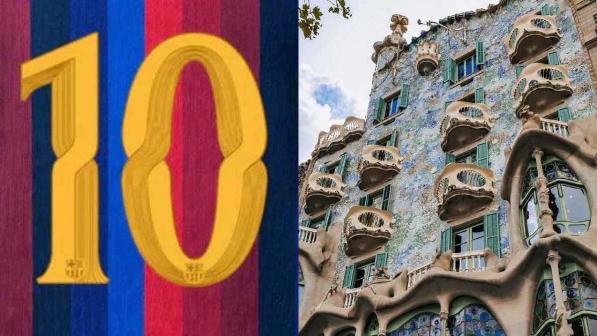
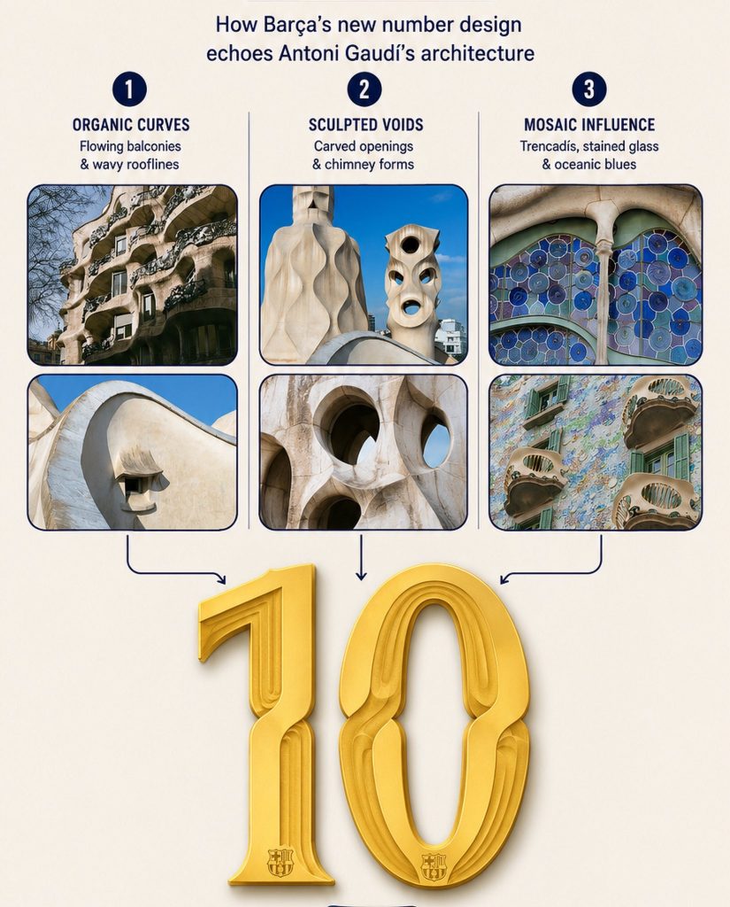
Barca’s new font directly mimics iconic landmarks that define the Barcelona skyline. The new number design echoes Gaudi’s architecture on three features:
Organic Curves: The letters mirror the asymmetric, flowing balconies and wavy rooflines with stone undulations of his unique art structure in Casa Mila and Casa Batllo
Sculpted Voids: In numbers like 0, 6, and 9, the inner voids are shaped like the organic, asymmetrical light wells of Casa Milà, directly mimicking the building’s famous carved openings and sculptural chimney forms.
Mosaic Influence: Instead of drawing crude, puzzle-like fragments onto the jersey numbers, the designers subtly reinterpreted this artisan spirit using modern vector graphics. The design is directly inspired by trencadís (the famous mosaic technique) popularized by Gaudí that uses fractured pieces of colorful ceramic, tile, and glass to wrap around fluid architectural curves
The typeface will be used exclusively for the names and numbers of the Blaugrana first-team kits.
The men’s and women’s first teams (Barcelona Femeni) will wear it in the UEFA Champions League, the Copa del Rey and the Spanish Super Cup. Due to strict league regulations, this custom typography will not be worn in La Liga, as all Spanish top-flight clubs are required to use a standardized competition font.
🪨 Barça's Gaudi inspired new font. pic.twitter.com/r63mzSdx3Z
— esvaphane (@esvaphane) July 1, 2026
However, to adhere to contrasting competition rulebooks, the club is deploying two distinct variations for the Champions League and domestic cups.
This is because UEFA equipment regulations strictly forbid multi-layered background graphics or distracting internal patterns on player numbers to maintain maximum broadcast visibility. As a result, the Champions League variant features solid-colored numbers without the decorative inline stripes. Barcelona is the first club to integrate its city’s historic architecture into its European identity.
In the Copa del Rey and the Spanish Super Cup, the font retains its full artistic integrity. This version includes the layered background lines and internal stripes, designed to replicate the hand-crafted mosaic textures seen in traditional Catalan monuments.
This new typeface identity will also be used by all professional youth academy categories, and club branding materials at the Spotify Camp Nou stadium.

