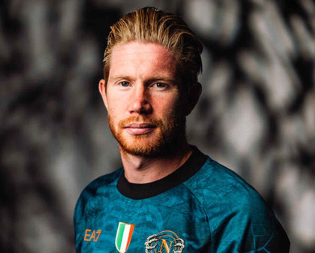
With the season of spookiness looming on the horizon, SSC Napoli has unleashed their complete creative side while designing their 2025/26 Halloween kit. The Italian champions have proven once again that their jersey game is leagues ahead of other clubs. The kit has been designed in partnership with EA7, which becomes Napoli’s fourth Halloween drip in the last five seasons.
It is one of the boldest kits compared to all other clubs, and the design has taken into consideration the club’s iconic sky blue while sending shadows into a deeper and duskier tone that sets the perfect stage for the nightlike scene of Halloween.
The kit dives into the Neopolitan soul with a central skeleton and spine graphics which merge football’s physicality and the city’s centuries-old stories of the afterlife. It is also a tribute to Naples’ anime pezzentelle tradition, which is the act of adopting and praying for anonymous souls and their salvation as an expression of mercy and remembrance.
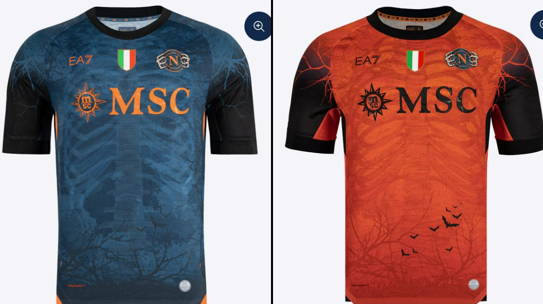
EA7 and Napoli have used this symbolism to bridge the gap between the living and the dead, which marks the depiction of the skeleton as not just a Halloween design but also a reflection of Naples’ mystical culture. In short, the kit is spiritual, gothic, proudly local, and an aesthetic masterpiece.
The lower section of the jersey features dusky woods with bats flying around bare trees. This creates a moody, cinematic backdrop again signifying Halloween with a Neopolitan twist, making it look eerie, elegant, and full of stories from the past. The bold design also features a crew-neck collar and black sleeves, which add more touches of darkness with light in orange side panels and trims, giving a fiery edge to the modernistic design.
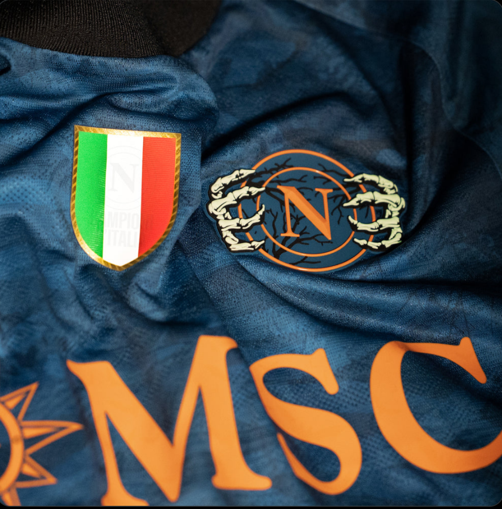
For the away kit, the design has taken opposite colours from the home kit, with orange being the primary tone with dark blue inner strips, giving a contrasting look while still being true to the Halloween theme. One thing that has caught the attention of the fans appreciating the kit is how to crest has been reimagined with skeleton hands holding it.
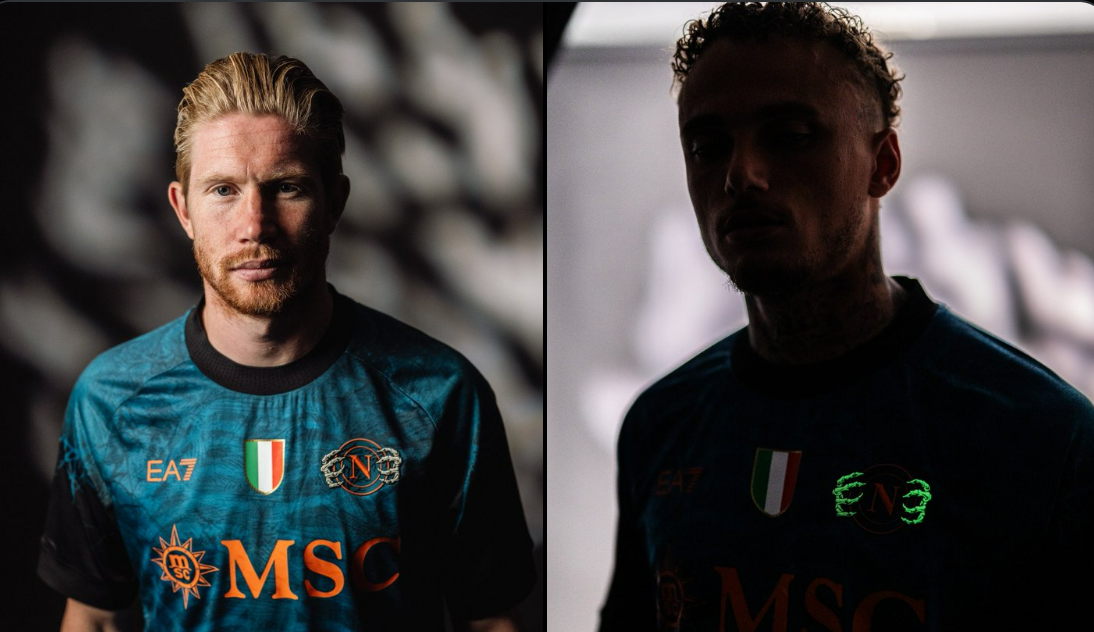
It has a glow-in-the-dark design, almost looking as if the skeletal hands will tear the crest apart from the kit. While it looks a bit creepy, there is no doubt that any football fan would love to have this jersey in their collection. All the sponsor logos follow the same colour palette, which keeps the colour scheme consistent and vivid for the games under floodlights or moonlight.
They have also gone with a similar trendy pattern for the goalkeeper version, with a blazing orange base and black details. It also features the same forest-and-skeleton print, while the color swap gives it a different look, as if the keeper came straight from Halloween’s underworld, as if the player is someone to fear.
This kit is more than just prints on a jersey; it is a tradition now. Since 2021, Napoli have made Halloween a part of their club culture, using this occasion to celebrate creativity alongside the heritage of football fashion.
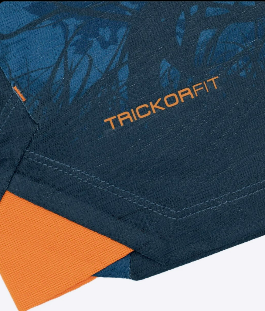
The details on this jersey also feature a ‘TRICKORFIT’ slogan. This amplifies the spirit of Halloween, which is related to ‘Trick or Treat’ that is a common phrase that kids say when they go over to other houses collecting candies. Over here, it is an amalgamation of advanced technology used by EA7 to make sure the jersey remains dry even after the constant running and sweating it has to endure, alongside a catchy tagline.
Napoli are set to debut this kit either against Inter on October 25 or Como on November 1. However, one thing is guaranteed: among all football clubs, Halloween certainly belongs to Napoli. The club is giving its everything from the spooky collections to kits with a symbolic, artistic, and the right shade of creepy, which would be intimidating on the pitch.