Nike‘s themes for Liverpool kits this season have been somewhat inconsistent.
By no means are they horrendous to look at, the kits are almost oddly juxtaposed, especially in terms of aesthetics.
Usually, sponsors play it safe with the traditional home kit, create catchy looks for the secondary one, and take liberties with the Third version.
For the Reds, Nike have indeed played it safe with a classic look for the primary shirt.
However, the other two really fall in a more eccentric vein, with plenty of liberties taken for both looks.
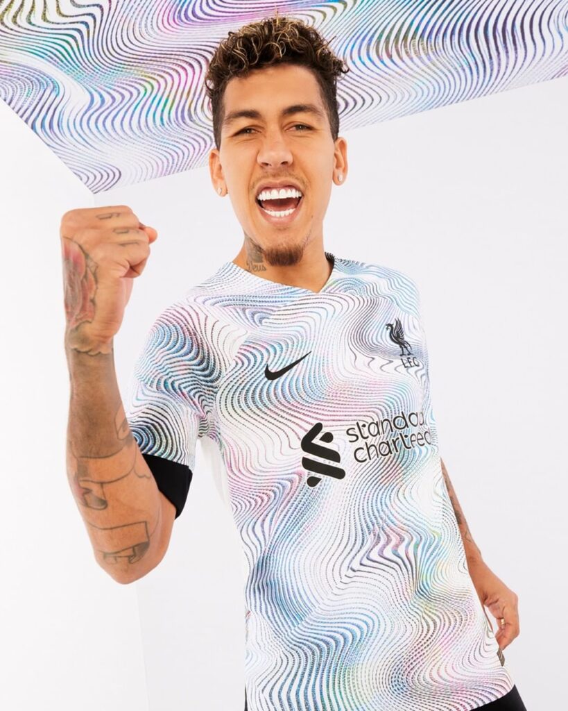
The white away kit is as ‘wavy’ as it gets, featuring a swirly graphic inspired by the city’s vibrant music scene.
The kit is a looker, paired with black accents on an icy white base.
The third kit pushes further into ‘eccentric’ territory, bringing to the fore another wavy graphic, printed on a Teal base on this occasion.
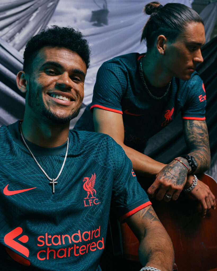
The waves are subtle here, the central design really has an almost velvet feel to it.
However, the overall look deteriorates a bit, seemingly because of the colour used alongside the predominant Teal.
Nike opted to go with a bright shade of red for the various logos and accents, which doesn’t gel in quite as seamlessly as they would’ve hoped.
It’s still an attractive look, but not as ‘clean’ as it could’ve been.
Fortunately, a user on Twitter made some nifty alterations, which display probably the best version of the kit, and also highlight how much of a missed opportunity the original was.
The edits, made by user @Agger4R4ul_, are minimal in nature, but they still managed to do a world of good overall.
It all lies in a simple swap, with white being used for the accents instead of red.
The alternation leads to much better colour contrast, especially when factoring in the sleeve cuffs.
White lettering underneath the Club crest is another notable improvement and it gives additional flair to the look.
Reds online were just as impressed as we were with the edit, and many even declared it an upgrade over the original.