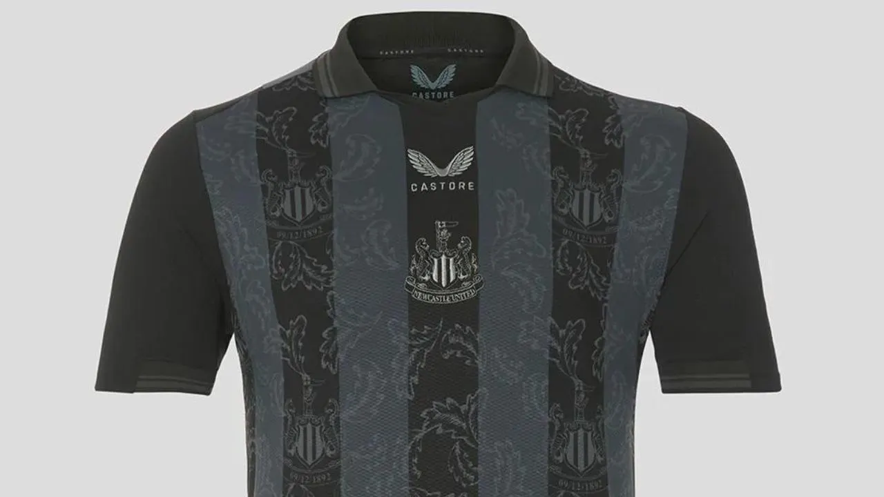
To celebrate the upcoming 130th anniversary of the club, Newcastle United have recently dropped a brand new special edition 4th kit along with sponsors Castore.
The Magpies have enjoyed a storied history, featuring 4 League titles and 6 FA Cups in terms of silverware, and numerous legends including the likes of Alan Shearer, Paul Gascoigne, Gary Speed and many more.
Designed by the British sportswear brand, the kit seeks to celebrate this rich lineage by paying homage to the club’s many historic moments.
As for the design itself, Castore have evidently gone the ‘blackout’ route.
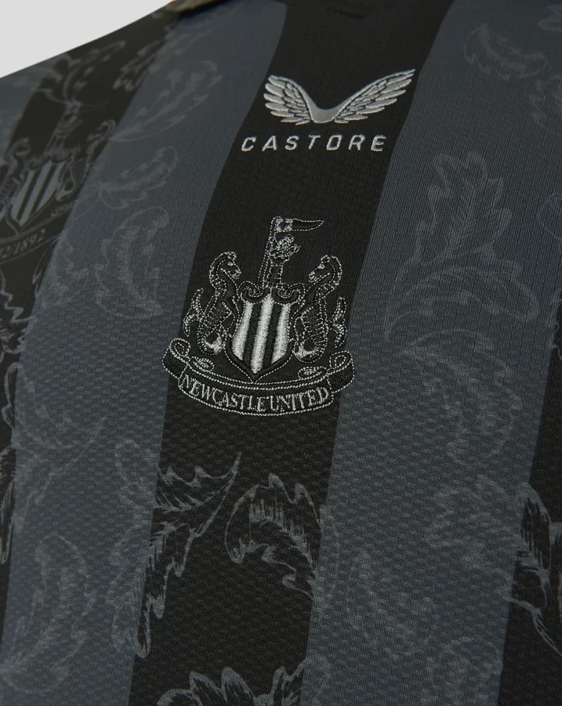
Black and grey in colour, the kit features thick black stripes running vertically on a grey base.
Embossed at the front is a subtle print, displaying the club crest surrounded by feathers, both of which have silver outlines and blend into the base.
A neat touch comes in the form of the crest’s label, as instead of ‘Newcastle United’, it now displays the club’s founding date.
Moving onto logos, Castore have opted for the in-fashion vertical orientation, with the company’s logo and club badge stacked on top of each other.
Interestingly, the logo of shirt sponsor Fun88 has been omitted, which will undoubtedly please the Toon Army.
The back goes all-black and features some neat NUFC lettering along with silver text that reads ‘130 years’.
In recent times, Castore have earned a rather notorious reputation for simply rehashing retro designs, or just offering a lack of creativity in general.
Their most recent release with Newcastle does show splashes of ingenuity, so how is it faring with the public?
As far as initial impressions go, it’s not looking good.
A majority of fans are displeased with the kit and have levied critiques on the primary design itself.
Their gripes stem from the seemingly lacklustre pattern, which fans have hilariously likened to wallpaper.
I had this exact wallpaper in my bedroom as a kid.
— Jonny Sharples (@JonnyGabriel) October 14, 2022
That might be the most disgusting shirt ever made.
— Frank (@Bigfrankchippa) October 14, 2022
It’s no good having a shirt like that skin tight man. The fit is crucial with retro-inspired shirts. Got it totally wrong again, think the brand would benefit massively from a fan forum to realign themselves with what people actually want to wear. We’ll get there!
— ben (@benrelton) October 14, 2022
Trying to cash in before they are kicked out .. worst kit manufacturer ever .. bring on adidas 🙏🖤🤍
— 🖤🤍 Derrick Hardy NUFC 🖤🤍 (@DHardy8) October 14, 2022
It’s absolutely lifting. Ruined the 130 year celebration which I’ve been looking forward to for ages tbh
— Bob_Helpful (@Bob_Helpful) October 14, 2022
Moving onto more particular stuff, fans were also left annoyed by a poor alignment error, unless it’s intentional of course.
As seen in this image, the silver text on the back is slightly tilted, and we’re struggling to imagine any reason for it to be an intentional choice.

Overall, Castore’s efforts appear to have missed the mark.

