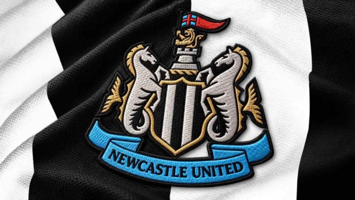
Newcastle United have unveiled their first crest change in nearly 40 years, and fans have decided it is hard to spot.
The club says that is the point, because the new crest is meant to be an evolution and not a reinvention.
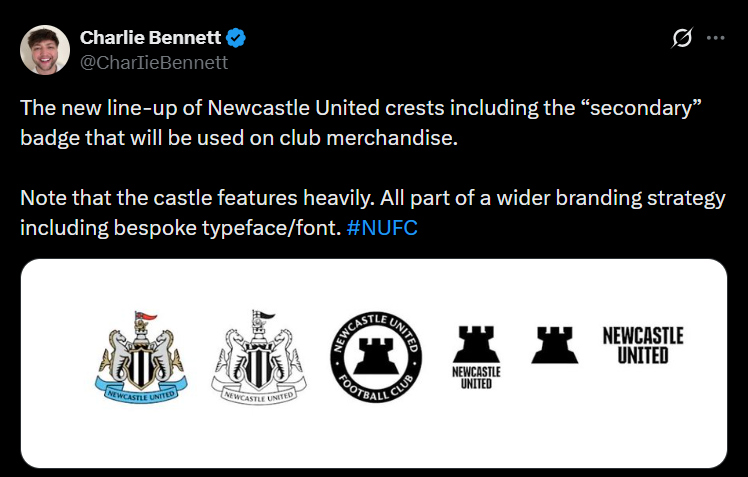
The real changes are subtle, and the biggest differences sit in a wider set of secondary badges.
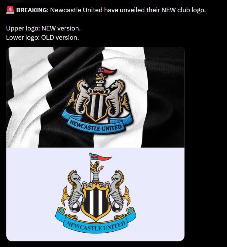
The new crest keeps every element of the old one.
The black-and-white striped shield, the castle, the two hippocampi (seahorses), the golden lion with a St George’s pennant and the blue ribbon carrying the club name all remain.
What changes is the execution, with sharper lines on the castle, shield and seahorses, and a lion that looks more stately. The club says the castle has been “fortified within our new crest design”.
The old badge dates from 1988 and was largely derived from the city’s coat of arms. In May 2025, Newcastle announced plans to update it because the design was too intricate for digital use and merchandise.
The club said the new version must “show up clearly and confidently” across both.
It promised to “refine and revive” the badge and not walk away from its past. Its introduction on playing kits was later delayed until the 2027-28 season.
The club ran about two years of consultation with supporters.
More than 27,000 fans took part in a ballot, and 84% voted to refine the current design and not reinvent it.
The clear message from the process was to keep the badge close to what supporters already knew.
The wider brand is where Newcastle has gone further.
The castle becomes a secondary mark and brand signature, appearing as a circular roundel with a solid castle and the words Newcastle United Football Club.
There are also standalone castle icons, lockups with the club name, and a bespoke typeface. The club calls it a cohesive brand system, aimed at a more consistent, globally facing identity.
The new crest appears on digital platforms first, then on playing kits from 2027-28, with a brief appearance before the end of this season.
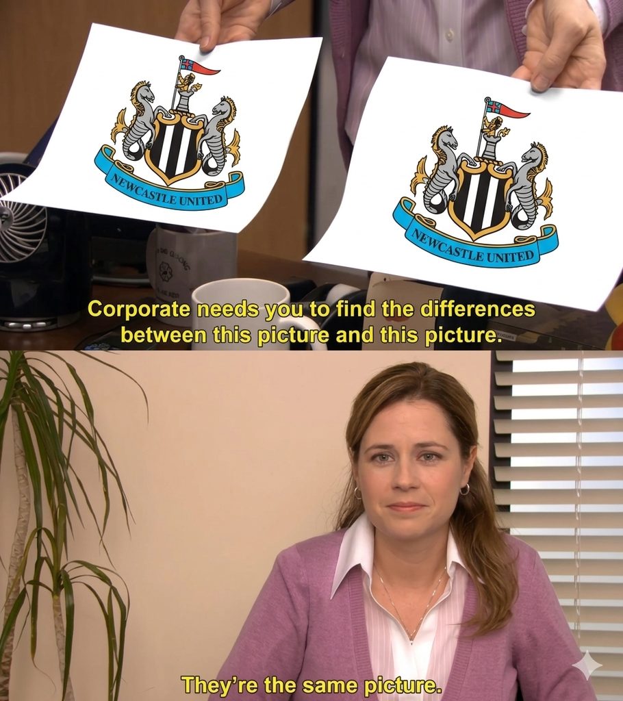
Soon after the reveal, supporters and rival fans were flooding social media with “They’re The Same Picture” meme template. Here are 3 that caught our attention –
One of the most shared compared the new crest to The Office scene where Pam Beesly holds up two sheets of paper for the aged veteran Creed during a prank, then looks at the camera and says, “Corporate needs you to find the differences between this picture and this picture… They’re the same picture.”
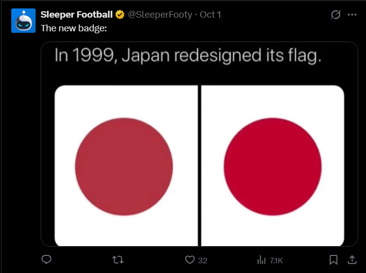
Another posted the new badge with a “Japan redesigned its flag in 1999” graphic showing two near-identical red circles. The joke format pokes fun at redesigns that barely change anything. The two crests are indeed close enough that fans needed a side-by-side comparison to spot the sharper lines.
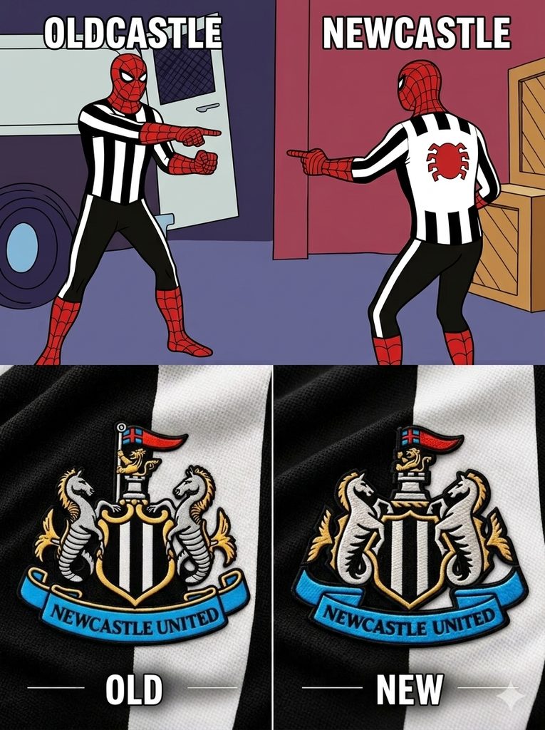
A third meme used the Spider-Man pointing format, with one Spider-Man in a black-and-white shirt labelled “Oldcastle” and the other labelled “Newcastle”. The pun on the club’s name is the hook, and the meme also lands the central joke. The club has spent two years on a change that few people can see.
Whether fans find it clever or underwhelming, the new crest will be on the kits soon enough. The real test comes when it appears on the 2027-28 shirt, and fans see the new lines in person. The memes show how much attention a small change can attract.