Whenever Adidas and Arsenal combine, it usually makes for some delicious kits.
But based on the leaks for next season’s away strip, the typically formidable duo looked to have cooked up a proper mess.
The German sportswear brand rarely misses when it comes to the Gunners’ threads. This season alone Adidas supplied the league leaders with 3 incredible kits.
Showcasing a variety of colors and designs, Arsenal kit’s collection for 2022/23 included the sharp, traditional home kit and the eye-catching golden and black away strip.

Adidas built on its momentum by delivering a string of solid merch drops, an example being the special Arsenal x France apparel drop.
Unfortunately, the purple patch appears to be taking a brief halt, as credible sources have prematurely leaked the home and away kit for next season. And to say the least, it’s not looking good.
The home kit was the first to leak, and as stated in our coverage, Adidas looks to be taking inspiration from the iconic 2005/06 kit.
Aside from the classic red and white, the strip features gold lettering and accents, which on the surface seems like a bright idea but the execution is a bit off.
Fans online were of the same opinion, as they cast plenty of doubts about the look.
In contrast, the away kit received a far more limited leak initially, as only a few key features were revealed to the public. Now, however, full images of the kit are out in the wild and available for viewing.
Leaked by @afcstuff on Twitter, the away strip can be seen below.
On display is what seems to be a screengrab of some promotional material, there’s even a bit of content to the right.
But first, let’s get into the kit itself.
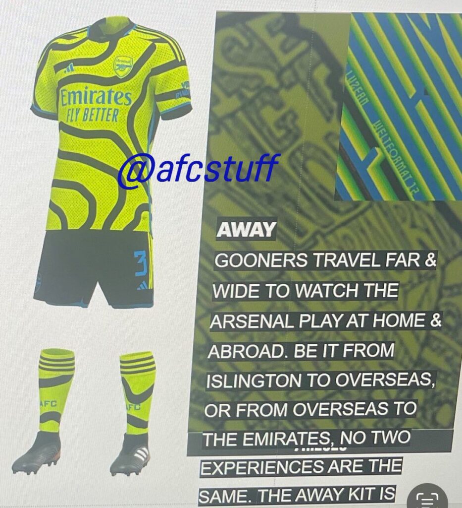
The overall look is best summed as ‘radioactive’ since there’s an abundance of neon green at play here.
The primary color is a fluorescent blend of yellow and green, paired with dark blue and black accents.
Blue is used for the various logos, including the new minimalistic Adidas logo, and for the trims around the collar and sleeve cuffs.
Elsewhere, black has been employed, most prominently on the attention-grabbing graphic strewn all across the base.
The graphic quite literally appears to be a bunch of wayward lines, which supposedly represent pathways, not unlike a map. We arrived at that conclusion through the bit of writing we mentioned before.
It appears to pay homage to the Gooners who travel far and wide to cheer on Arsenal, be it the fans from abroad or those from Islington.
Besides the graphic, the base also features a collection of spots or dots present all over.
While the colors blend and contrast with each other quite well, the pattern at the center of it breaks the harmony, at least for us. There appears to be no direction to them, which makes the entire look seem a bit haphazard.
The kit fares far better on Arsenal star Bukayo Saka, as seen in this edit, and fans might just warm up to it after the players don it.