Liverpool’s possible third kit that was partially leaked back in December 2023 has clawed its way back into trend after a recent spill on X. An image of what can be the third kit of the Merseyside Reds has been making rounds and has the fans in a fix.
Nike, the shirt manufacturer for the club since 2020 has come up with a design that honestly looks trendy and very in-tune with the modern style language. However, it is another feature of the kit that has the people talking. Nike, a giant in the sports goods industry has decided to change its logo itself.
Although the imminent change was known to the world for a long time, how it would look on a shirt remained shrouded in mystery till now.
However, on Monday, an X user named KB2x posted a picture of the possible third kit from what looked like the Kitroom Sports outlet in Hong Kong. In a Facebook post by the same store, it said, “Liverpool 24-25 Second away fan version, Available in size L for now.”
Liverpool’s third kit leaked: How it looks?
The home and away kits for the upcoming 24/25 season are both classy and edgy. The gym red shirt features yellow stripes reminiscent of the 2019/20 International treble-winning season. The badges are yellow and their motto, “YNWA” also features under the phoenix. The anthracite black away kit also looks very modern with its washed teal cuffs and white badges.
The third kit looks nothing out of the ordinary either. It is a plain white kit with a gray undertone and different shapes of shades on the body. The collars are red with a white border, a combo that runs in the cuffs as well. So, what’s the ruckus about then?
It is the SWOOSH. Nike has decided to rotate the swoosh 90 degrees anticlockwise in the third kit to confirm the rumours that were hanging in the air for a long time. Ever since their launch of the Phantom Luna cleats in June 2023, fans have been expecting the vertical swoosh. Now it seems the Oregon-based company is finally bringing it out. The logo also features a smaller yellow swoosh inside the larger red swoosh.
Social media divided over the kit
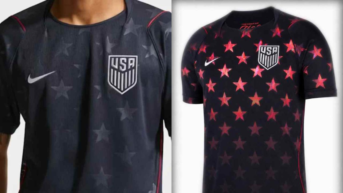
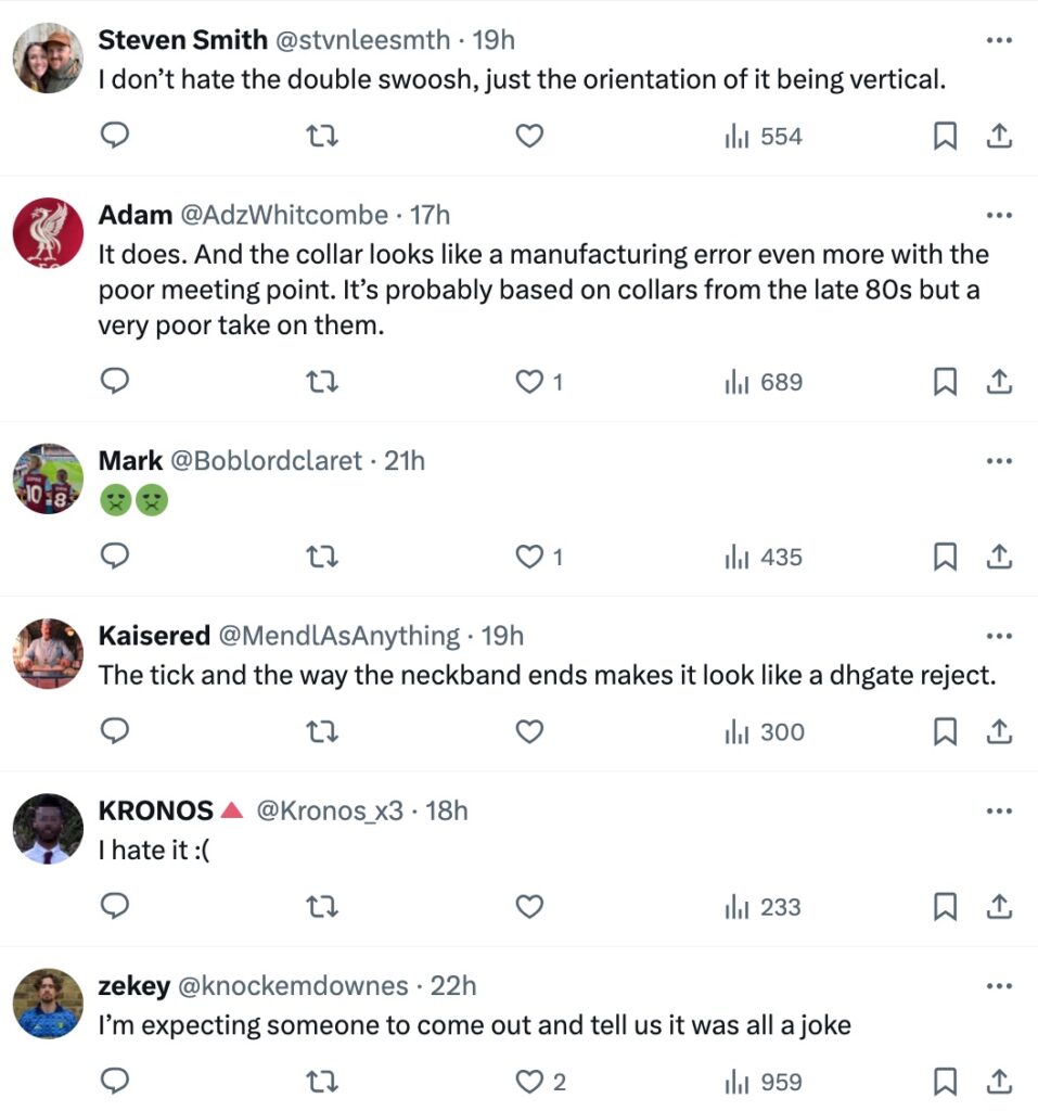
The kits, as a whole, look very versatile but the swoosh, although iconic, looks odd to the eye at first glance. One really needs to tell the mind that it is a brand decision and not a printing mistake. Nike has done the same with the third kit of Barcelona, which also leaked earlier this year.
The creativity of FT was also on full display. While some claimed that it looked like a cheap knock-off of some other kit, others sounded more optimistic about the look and feel of the kit. Although the “upswoosh” will probably not be the ‘make or break’ for many, the collar design certainly needs more thought. The meeting point of the collar will definitely make the wearer look slightly odd, if not anything.
Why did Nike change the orientation of the Swoosh?
The swoosh, just like the golden arches, is one of the most recognizable logos in the world. It symbolizes the wings of the Greek goddess of victory in Greek mythology, Nike. Therefore, a change in its orientation should carry a reason behind it.
Nike, who also makes the shirts for the England national team, got into hot waters earlier this year. Their decision to alter the colors of the St. George’s Cross received widespread criticism and scrutiny.
The logo has certainly gone through small alterations every now and then but it has never changed this drastically since 1971. So what heralded this change? As of now, the company has yet to confirm its design and the reason behind this supposed verticalization.