With the new season kicking off soon, kits of clubs from around the world have started to be unveiled on pitches. With a few attracting eyes and a few receiving negative feedback, it’s almost like every season’s kit reveal all over again until a specific jersey from a club caught all the attention.
Manchester City’s pre-season friendlies kicked off against Inter Milan with a disappointing 3-4 penalty shootout loss, but the result wasn’t the only talking point of the match.
During the game, fans couldn’t help but notice Donnarumma wearing the latest goalkeeper kit of Man City and left the internet in absolute splits.
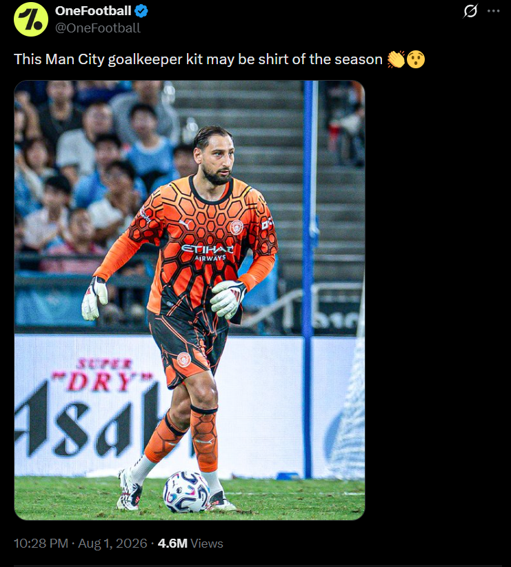
The vibrant Puma goalkeeper kit got the fans talking about how the kit instantly catches the eye of whoever looks at it and the colour combination gelled well together. The kit featured a color scheme of orange and black dwelling on the kit with intricate circular designs covering the entire body of the keeper.


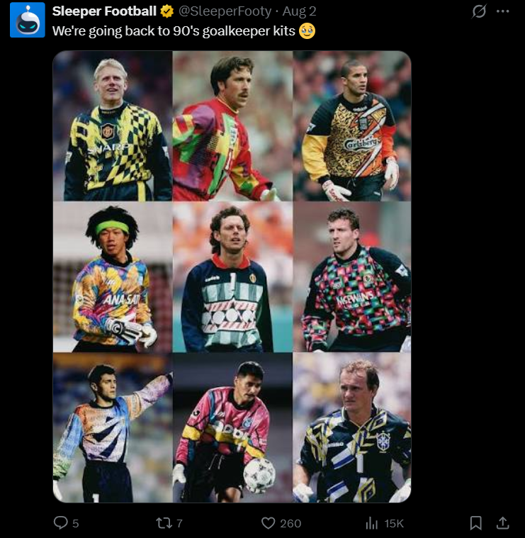
Fans seemed to notice how this jersey could be a nod to retro goalkeeper kits.

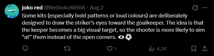
A fan pointed out the psychology behind having a chaotic colour scheme for the keeper’s jersey.
Not only praise, the kit also attracted quite an amount of criticism from fans.


Keen eyes from fans noted how Puma was lazy when coming to drafting goalkeeper kits as Borussia Dortmund seems to have the same goalkeeper kit yet with a different color scheme. The 26-27 away goalkeeper jersey features the exact same patterns, but in a different color scheme.
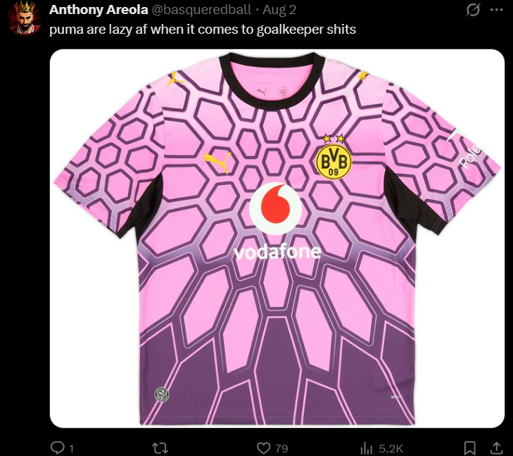
Call it lazy effort or genius marketing, Puma has got the fans talking with a different approach for goalkeeper kits which fans hope to see repeated by clubs in the future.