With the ‘Finalissima’ against Argentina just days away, Italy have launched their brand new home kit for 2022. This year’s iteration will be Puma’s last design for the time being, as they are all set to be replaced by Adidas in 2023.
The shirt can be seen in this image, with Inter Milan duo Alessandro Bastoni and Nicolò Barella giving us the first look, alongside Chelsea midfielder Jorginho.
The kit is based on the Puma Ultraweave template, which will be utilized for all kits designed by the sportswear brand this season.
Sticking to traditions, Blue remains the dominant colour and the base is enveloped in 2 different tones of it. A subtle quarter graphic takes centre stage with the 2 shades, ‘Ignite Blue’ and ‘Ultra Blue’ placed alternatively.
The kit has no scarcity of details, with the national crest featuring a golden outline, along with 4 stars placed on top, to indicate their World Cup triumphs.
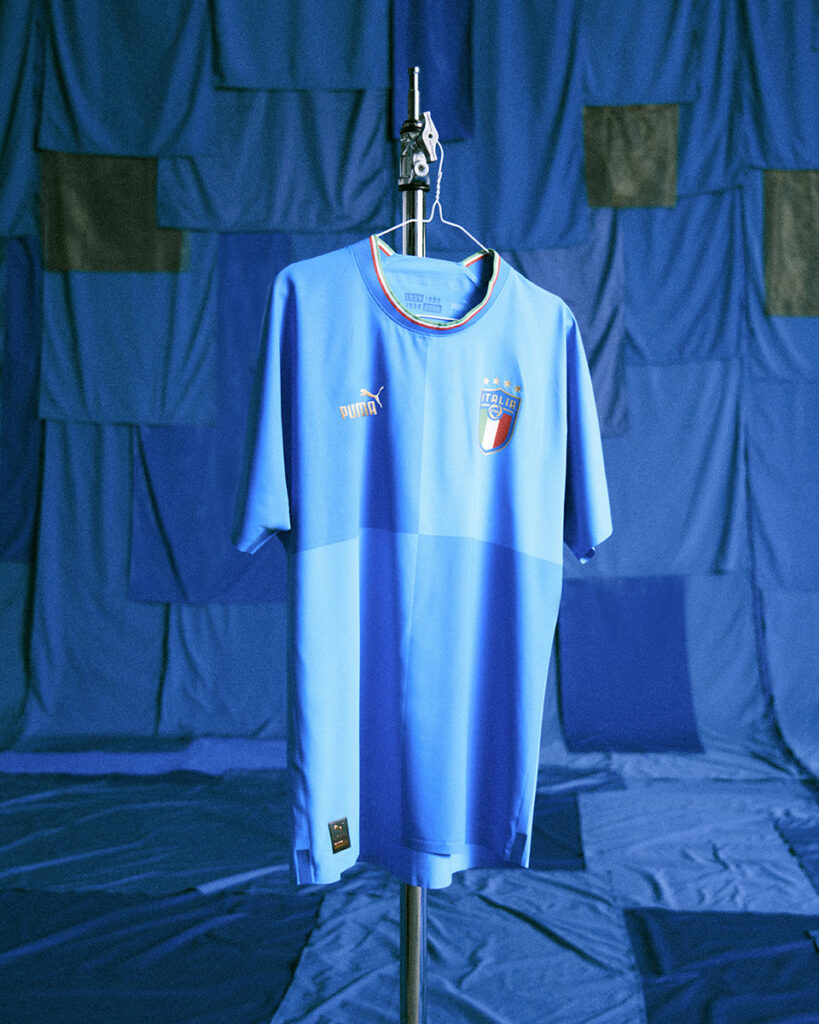
Furthermore, the Puma logo goes old school, with the classic ‘Puma’ text placed alongside the logo, all coloured in gold. The basic round collar displays a neat touch, as it has been painted in the colours of the Azzurri – green, white and red.
Initial reactions to the kit have been rather mixed. The kit was created with the upcoming Qatar World Cup in mind, which Italy eventually failed to qualify for.
Naturally, there was plenty of trolling surrounding the subject.
home kit coz they're watching world cup at home
— halal FENTANIL 💊 (@Baboyel08Ka) May 30, 2022
Aside from that, fans were generally unimpressed with the panelled design, and even many drew hilarious comparisons to the Microsoft Windows logo, with which it shares an uncanny resemblance.
Ah yes pic.twitter.com/yGrYuIYeJ2
— Leon (@LeonBVB_) May 30, 2022
Perhaps seeing the kit in action against Argentina will change public opinion.