Club rebrands have become a standard practice in modern football, allowing for a subtle change of style that feels like a breath of fresh air.
It’s important to preserve the club’s core identity while attempting to rebrand, failure to do so will certainly lead to a horde of livid supporters.
Recent examples of such a move include Italian outfit Juventus, who introduced a bold new badge, which happened to coincide with the arrival of Cristiano Ronaldo.
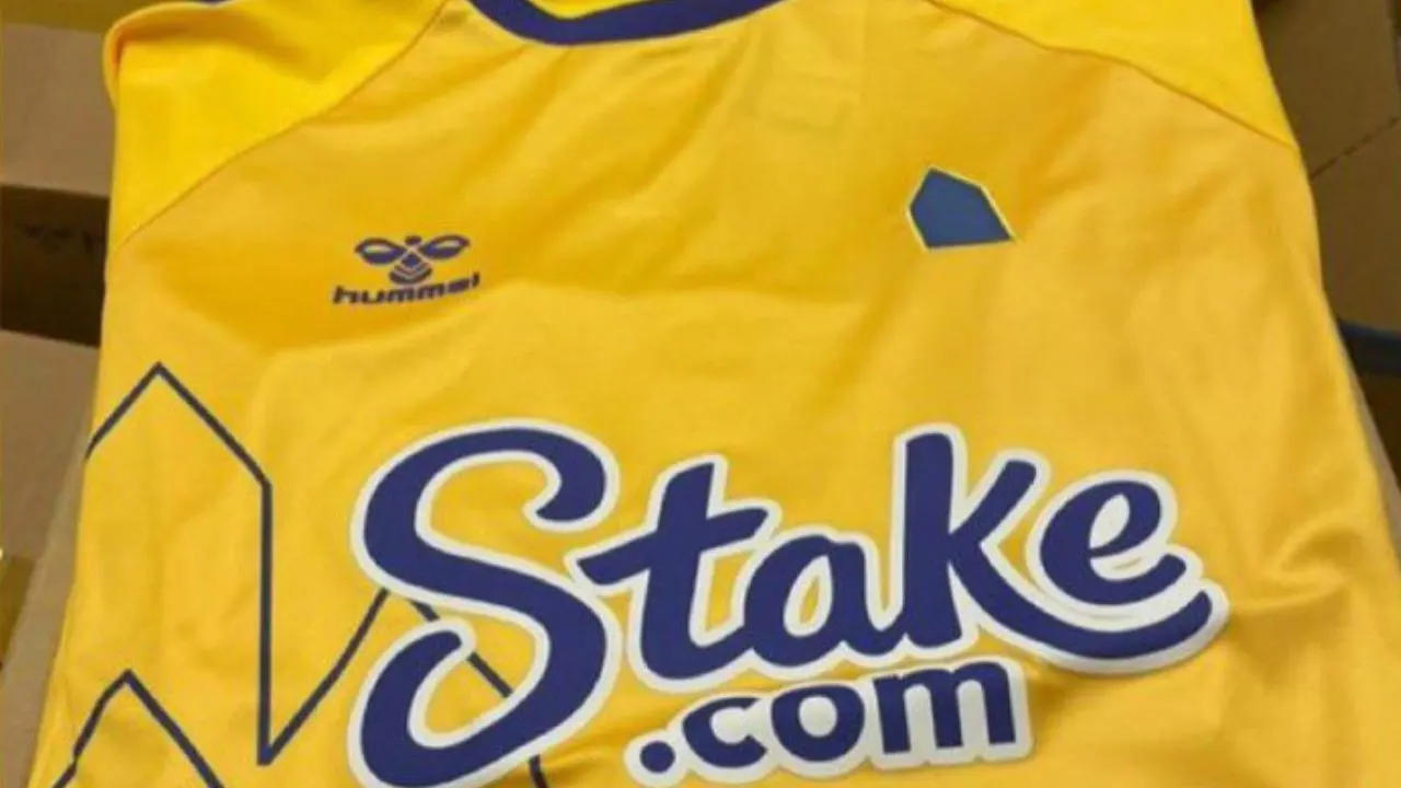
By the looks of it, Premier League side Everton are looking to do the same as hinted at by their third kit, which recently leaked.
The Merseyside Blues’ branding thus far centred around a graphic of Prince Rupert’s Tower, which is also visible on the current club crest. Their upcoming rebrand will retain this element while introducing a more modern and minimalistic approach.
Designed by Hummel, Everton’s brand new third kit offers up a rather vibrant look with bright yellow as the base and blue accents all over.
The sponsor logos are wrapped in Blue and so is the crew-neck collar. Hummel’s signature chevrons also feature on the shoulders.
The most eye-catching details certainly are the new tower graphics, a blue-coloured version of which sits on the front.
Additionally, the towered-themed motif has been adopted for the club crest as well, as it is now simply a Blue silhouette of Prince Rupert’s Tower instead of the usual Everton badge.
Rebrands always draw out begrudging looks from the fanbase, who are usually dismissive of such changes.
However, Everton supporters appeared to be rather supportive of the idea, and even suggested an ‘EFC’ lettering from the crest, instead of the Tower. It remains to be seen just how many changes are headed Everton’s way.
Totally get where Hummel are going with this after we spent a fortune on the new Tower branding package but you have to go with the EFC script. Looks miles better pic.twitter.com/Pod2kkpMr8
— Stephen Paddy Dyson (@SDysonX) August 2, 2022
Hopefully, the club will take into account fan suggestions.


