Manchester United’s home shirt carries more weight than most kits in world football.
The red shirt is one of the most recognisable images in the game, tied to Old Trafford, European nights, title-winning teams and some of the club’s greatest players. For United supporters, a home kit is not just another yearly release. It has to feel like Manchester United.
Supporters want something that feels fresh, but not unfamiliar. The shirt has to look modern enough for the current team, while still carrying the traditional Manchester United feel: red shirt, white shorts and details that belong to the club rather than just the manufacturer’s template.
Over the years, United kits have taken many different directions. Some have been simple and clean, built almost entirely around the power of the red shirt. Others have included stronger design features, from sharper collars to patterned fabrics, sleeve trims and throwback details.
Adidas, in particular, has often tried to use United’s home shirt as a way of connecting the club’s present with parts of its past.
Adidas emphasised that connection, with Manchester United’s 2026/27 home kit.
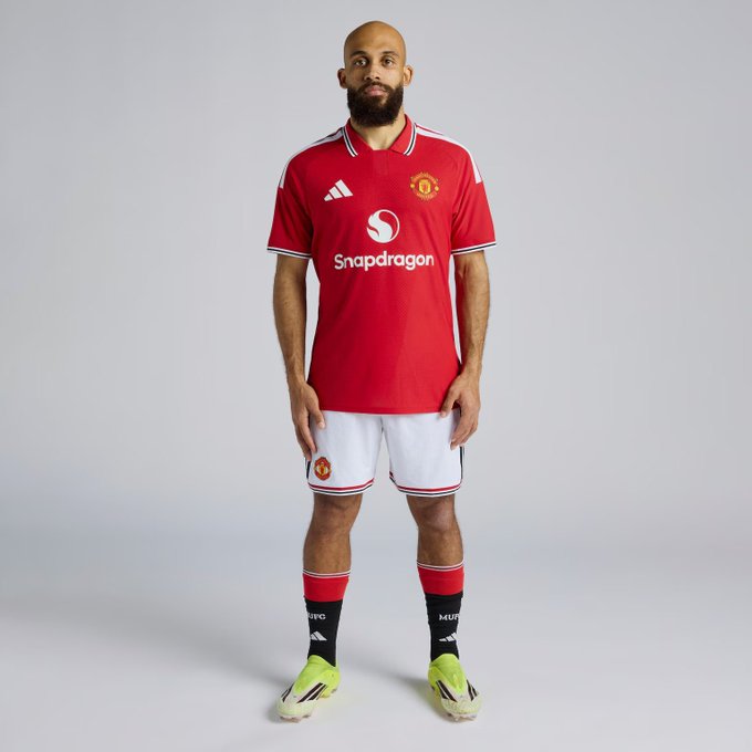
At first glance, the shirt does not move too far away from tradition. It keeps the classic red base, with white Adidas stripes on the shoulders and the club crest on the chest.
Paired with white shorts and black socks, the full kit still looks immediately like Manchester United.

The shirt appears to take inspiration from the club’s late-1970s look, especially the period around the 1977 FA Cup final.
That era remains a meaningful part of United’s history, not only because of the Wembley win over Liverpool, but also because the shirts from that time had a very distinct visual identity.
🔙🔙 The key highlight of the Manchester United 26-27 home kit is the striped collar and sleeve cuffs, directly inspired by the Admiral designs worn between 1975 and 1980. https://t.co/VsmesKwl7q pic.twitter.com/65et0qHyiG
— Footy Headlines (@Footy_Headlines) May 14, 2026
The key throwback comes through the striped detailing.
Adidas has added black-and-white striping to both the collar and the sleeve ends, immediately giving the shirt an older, more traditional feel.
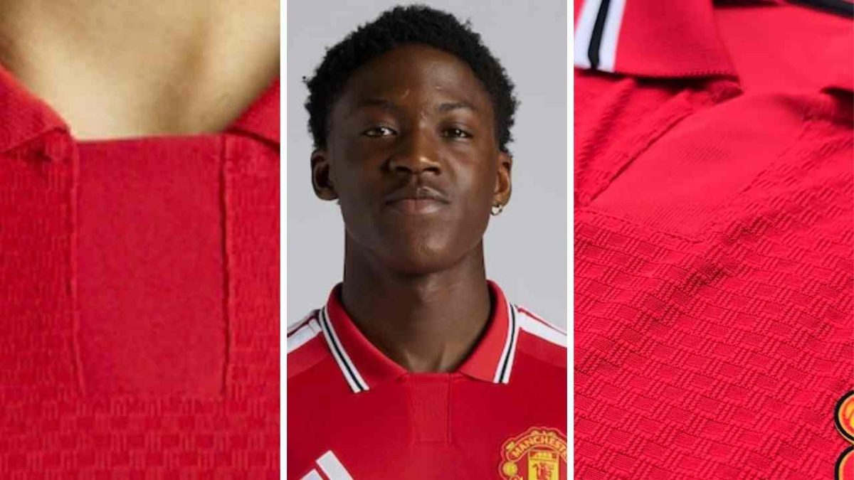
The collar itself is a fold-over polo style, which fits the retro direction of the kit.
The unusual part is the area directly underneath it.
On a typical polo-style football shirt, that section would usually have a clearer placket or button detail.
On this United shirt, Adidas has instead used a plain insert with no visible buttons.
That creates a slightly awkward shape at the front of the neckline, almost as if a buttoned section was expected but left empty.
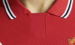
Because of that, the collar does not read as a straightforward retro polo collar. The striped trim draws attention first, but the blank patch underneath is what makes the design feel unusual.
It sits somewhere between an old-school polo collar, a retro V-neck and a modern performance-shirt insert, giving the neckline a slightly unfinished but very distinctive look.
Some fans feel Adidas could have handled United’s front collar area more like the Olympique Lyonnais 2026/27 away kit.
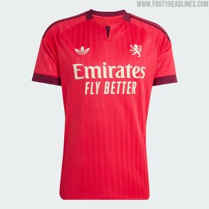
On Lyon’s shirt, the patterned collar and cuffs feel smoothly built into the design, giving the kit a polished retro look without making the neckline seem awkward.
United’s shirt takes a different route, and there is a reason for it.
According to the club, the shirt is a reference to the kit United wore during the 1976/77 campaign, when they won the FA Cup 50 years ago. The polo collar and striped cuffs make that reference clear, while the plain front insert gives the neckline a more modern Adidas finish.
Polo collar, striped cuffs…
— Soccer Jersey News (@soccerjerseynws) May 14, 2026
🏴 Manchester United 26/27 home kit x adidas.
According to the club, the shirt is a modern take on the one they wore when they won the FA Cup during the 1976/77 campaign, 50 years ago. pic.twitter.com/LxecEZGBW6
Whether fans love it or not, the 2026/27 home shirt feels deliberately United. It keeps the club’s traditions, draws from a recognisable period of kit history, showcasing the Red Devils’ rich history; all while adding one strange talking-point detail that will make the shirt remembered.
REFERENCES:
adidas & Manchester United Reveal 26/27 Home Shirt Design – SoccerBible. (2026, May 14). SoccerBible. https://www.soccerbible.com/performance/football-apparel/2026/05/adidas-manchester-united-reveal-2627-home-shirt-design/
Chris. (2026, May 12). Lyon 26-27 Away Kit Released. Footy Headlines. https://www.footyheadlines.com/2026/02/adidas-lyon-26-27-away-kit.html
Footy Headlines on X: “🔙🔙 The key highlight of the Manchester United 26-27 home kit is the striped collar and sleeve cuffs, directly inspired by the Admiral designs worn between 1975 and 1980. https://t.co/65et0qHyiG” / X. (2001, May 14). X (Formerly Twitter). https://x.com/Footy_Headlines/status/2055005223991623815
Morgan on X: “I didn’t clock this on the new kit. . . https://t.co/yrcKzPQlC7” / X. (n.d.). X (Formerly Twitter). https://x.com/utdscope/status/2054972146955301107?s=20
The Retro Kit Store. (n.d.). Manchester United 1975/80 Home Shirt. https://theretrokitstore.com/products/manchester-united-1984-86-home-shirt-copy