The past year or so has been a difficult one for Burnley. Having earned automatic promotion to the Premier League after finishing second in the Championship in the 2024/25 season, the Clarets were thoroughly outclassed by most of their opponents in the top flight.
They finished 19th in the Premier League at the end of the season, only two points above Wolves who endured one of the most disappointing seasons in Premiership history.
Now, they are preparing for another year in the second tier, and along with making wholesale changes to their squad, Burnley have also decided to replace their old logo.
In recent years, the club have been sporting a modern, simplified crest, which followed a pretty clean, monochrome aesthetic. This is in keeping with recent trends that have seen a number of teams ditch their traditional crests to go with a more minimalistic alternative.
One of the boldest examples of the drastic change that this can bring is Juventus’ transition from their traditional, oval crest, to a stylized “J” logo.
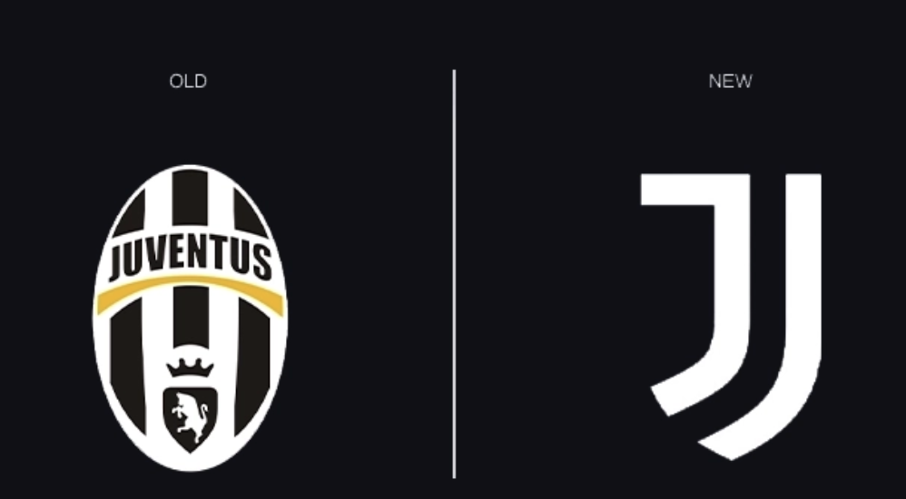
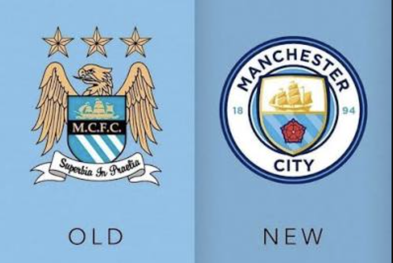
Manchester City also pulled off a drastic logo re-design, though it wasn’t as drastic as Juve’s alteration.
As the sport transcends borders and football clubs that were mostly locally supported now become global brands, the marketing teams are of the opinion that a more minimalistic approach can work better across digital media, merchandise, and international marketing campaigns.
Fans, however, are not always on board with such changes. When the club makes a big decision to abandon its traditional crest for a more marketable alternative, supporters are often left feeling like their team is disregarding its glorious heritage just for some extra cash.
But as football keeps flattening its badges into generic logos, Burnley have just refused to follow along.
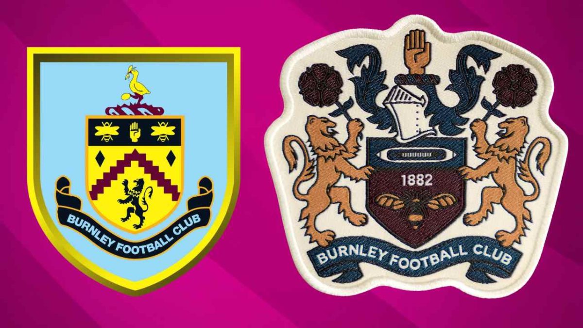
Ahead of the new season, the English club decided to go back to its roots. On Friday, Burnley made an official announcement to X, showing off their new crest design. This design, instead of being a brand-new, fresh design, is a recreation of sorts, drawing heavily from the badges Burnley used in the 1960s and later periods.
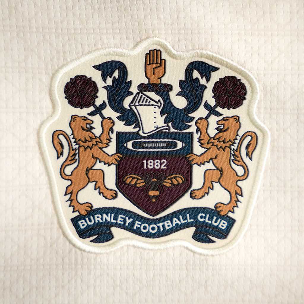
Traditional elements derived from the town’s traditional coat of arms, such as the shield, heraldic symbols, and overall composition, have all been retained, while the artwork has been cleaned up for modern use.
According to reports, NFL legend JJ Watt, who became a minority owner of the football club with his wife, Kealia, in 2023, played a key role in pushing for the use of this crest. Having been one of the top players in his sport for several years, Watt understands the passion and emotion of fans first-hand, and creating a crest that Burnley’s supporters would love was his top priority.
This vintage crest will only be used on the club’s off-white/cream away strip for the 2026/27 season, while the traditional claret home strip will feature the regular minimalist logo.
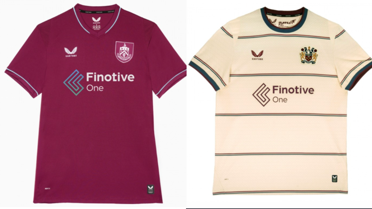
Credit – Footyheadlines
The major alterations include the shape of the shield. In the minimalist version, the shield was a classic, pointed design with rounded shoulders. The new logo, however, contains a more soft-edged shield with a decorative outer silhouette.
Like in previous editions of the crest, influential figures of Burnley’s history have been referenced in the crest. The raised hand in the middle of the crest is a nod to the Towneley family, a prominent landowning family whose roots can be traced back to Anglo-Saxon England.
The knight’s helmet in the centre honors the city’s civic history and heritage. Surrounding the helmet are decorative flowing leaves, which adds to the “coat of arms” aesthetic that the logo seems to be going with.
Then, beside the central shield, we have two lions, which represent the historic royal associations of the city and the strength and courage of it’s people.
The central shield itself also contains subtle references to the city and it’s history. The large textile shuttle in the middle is a nod to Burnley’s textile and cotton industry, while the number 1882 references the football club’s founding year. The two bees are symbols of industry, diligence, and the town’s working heritage.
While the new crest adds plenty of new details the old, monochrome design didn’t contain, it appears to have better symmetry and spacing, along with reduced visual clutter.
Based on some reactions from social media, it certainly looks like the new crest has made quite the first impression.
Beautiful. May this mark the beginning of the end of minimalism. https://t.co/O1wkLCZnd9
— Nasif🇧🇩 (@mo_nasif17) August 1, 2026
One fan went as far as claiming it was perhaps the “best redesign” in club football.
Best redesign in club football? That's actually incredible https://t.co/RJfm2cc4l2
— KyleRC (@_KyleRC_) July 31, 2026
As the new season inches closer, Burnley fans will be hoping the players can follow in the footsteps of the design department and give a good account of themselves with their performances on the field.