In a move that has come under quite a bit of criticism since its official reveal, Inter Milan unveiled their new identity, a new logo, which will be used in all of their marketing efforts from the beginning of next season.
The updated logo was released under a new campaign whose slogan read – ‘My Name Is My Story’ as the design focuses on the letters I and M for Inter Milano – to harness the English expression “I am”.
The new logo employs a different shade of blue than the previous one and none of the elements are in gold/yellow, a stark contrast from Inter Milan logos of the past.
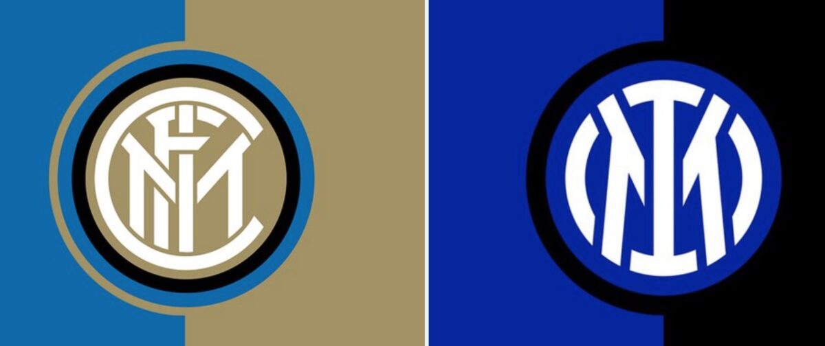
The overall revamp is aimed at improving the international marketability of the Italian giants but the move has been met with utter disdain from Inter Milan and football fans in general.
Inter have basically stuck an ‘I’ in the centre of the Marseille badge. https://t.co/tw234Fcusi
— Robin Bairner (@RBairner) March 30, 2021
The inter badge got lip fillers and became an influencer 🙁 pic.twitter.com/zeFxQqxoNN
— VUJ (@DavidVujanic) March 30, 2021
Inter Milan released its new badge and it’s another example of fixing something that’s not broken and making it worse. @UniWatch @PhilHecken pic.twitter.com/dGxoJjAXHn
— Trent Lowe (@thetrentlowe) March 30, 2021
The old school Inter fans when they woke up and saw the new logo today 🤣 pic.twitter.com/J3Z6KaeCd3
— Italian Football TV (@IFTVofficial) March 30, 2021
Soulless. https://t.co/Ac0rLZYMvQ
— Rafael Hernández (@RafaelH117) March 30, 2021
Why are Italian clubs opting for ‘modernised’ badges?
Inter Milan followed fellow Serie A side Juventus – who had changed their logo back in 2017 – in replacing their traditional crest with a modernised one.
A big part of the change seems to be the fact that the traditional logos lose clarity when seen on a phone screen. As mobile phones become the most frequent location where a logo might be seen, it makes sense for the clubs to opt for a design that looks much clear when seen on a smaller format size.
Though, clubs like Liverpool have managed to find a solution to the aforementioned without replacing their classic logo as they introduced a simplistic crest back in 2017 so that it could be used wherever resolution or clarity was an issue.