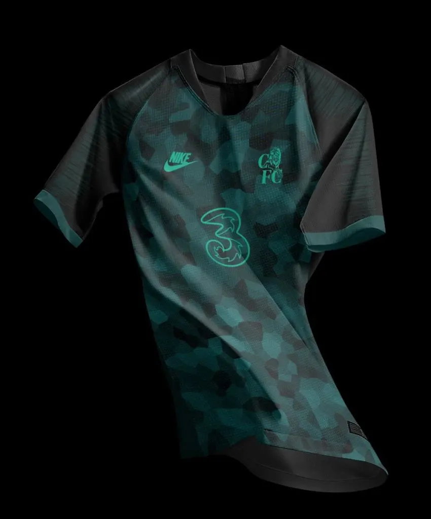
There is a stunning concept kit in turquoise doing the rounds on social media among Chelsea fans: and it might arguably be better than the West London club’s official kits for this season.
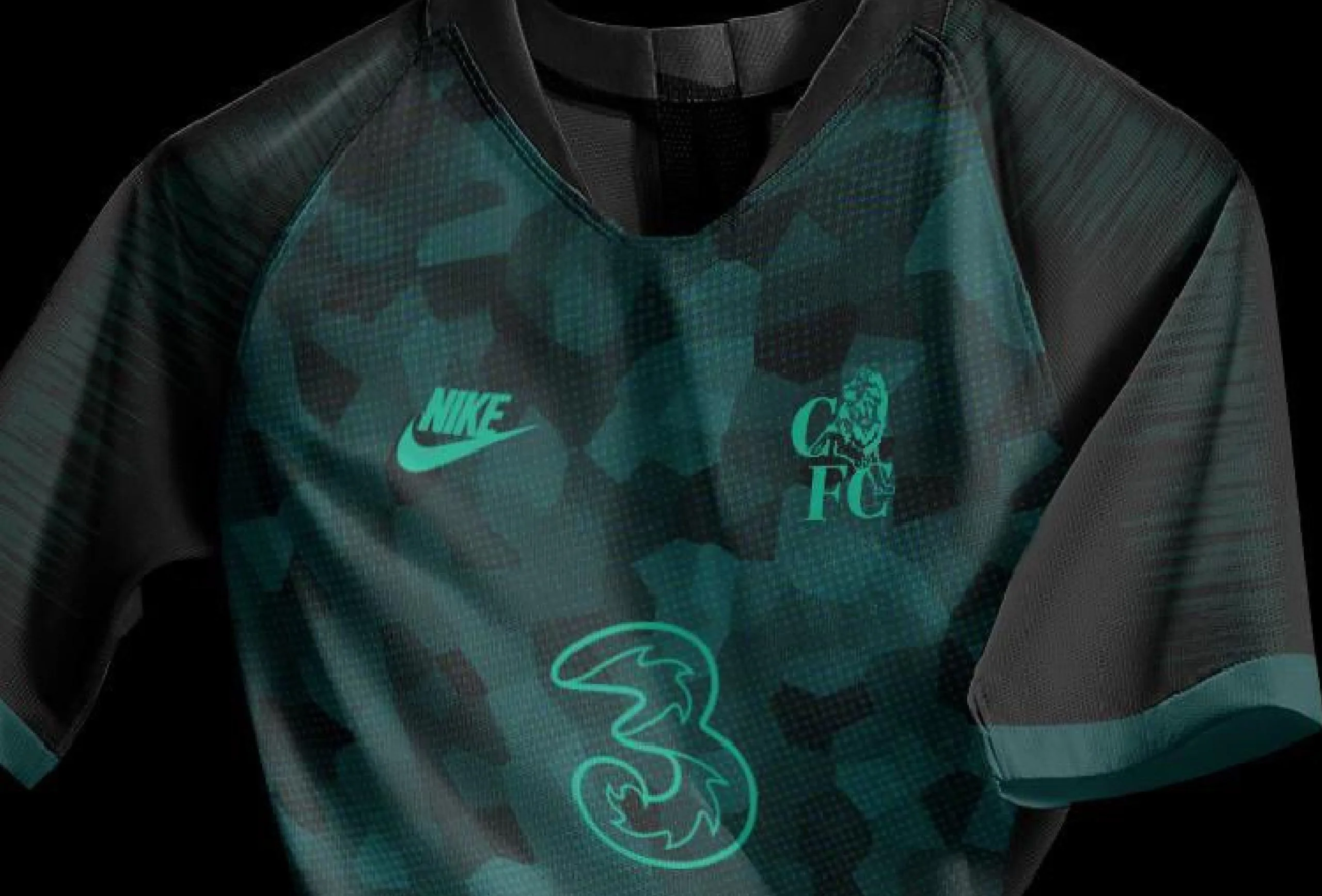
A design pattern in light turquoise has been set on the body of a black jersey, with the Nike, 3 and Chelsea (old) logo in slightly bold turquoise: while the neck is v-cut supported by slim collars.
The manufacturers’ logo is the variation used for many of Nike’s alternate kits this season, with the name imprinted above the logo: while the club crest on the shirt is a throwback to Chelsea’s club crest from 1986 to 2005, before it was altered to honour the 100 year anniversary of the foundation of the football club.
The kit is a sublime hybrid shuffling between both very modern and retro media at the same time, and it is safe to say that it is steadily becoming a favourite amongst Chelsea fans ever since it surfaced on social media.
Chelsea’s kits this season consist of a traditional home kit which comes in royal blue, an away kit clad in an ‘arctic blue’ variation of the colour and a striped alternate kit clad in red & ultramarine stripes.
While the alternate kit has mostly attracted criticism from the club faithful, it would not be an understatement to say that the Stamford Bridge faithful would prefer the aforementioned concept kit much more than the current one: with black previously featuring amongst the club’s away or alternate kits, most recently in ‘15/16 and ‘16/17.
Check out the concept kit in turquoise below –
