Chelsea finally unveiled their official away kit for the 2023/24 season three games into the new Premier League campaign and some fans immediately called them out for getting their marketing or promotional strategy totally wrong.
The Blues might not have a shirt title sponsor for the time being, but they don’t seem to be showing any hesitation at continuing with their plain shirts without any sponsor names in it. After playing their first three Premier League games in their home kit, the Blues have finally been able to unveil their away kit in a unique fashion.
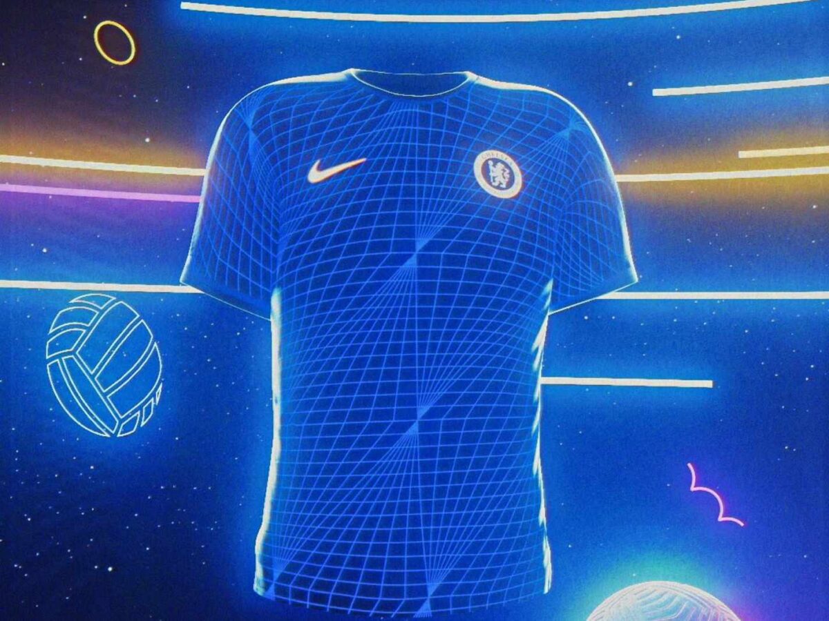
Chelsea unveil new away kit in CGI-heavy video
They unveiled it in a rather striking fashion through a unique video in which was developed in partnership with creative shop ‘The Berry Boys’, the video features players like Enzo Fernandez, Moises Caicedo and Reece James – as well as an AI version of female star Sam Kerr.
The video is filled with little Easter Eggs revolving around the club and is heavily inspired by CGI effects. Adidas appear to have kept the away kit relatively simple, as it also retains a blue colour with a n interesting diamond pattern design all over and a hint of gold touch too.
The unveil clip shows a look at the Chelsea lion, the logo and even captain James keeping the ‘Blue Flag Flying High’ by literally raising it up at one point of time. The mantra of this kit appears to be that it is heavily influenced by Chelsea’s kits during the 1990s and they tried to style the video to be very 90s’ heavy too.
In fact, the entire ‘mantra’ around the video is that it is 90s’-inspired, including the kit, the music and the overall aesthetic of the things happening inside the clip as well. They included a disco-inspired tune into the video along with a few eye-catching elements that serves as a pretty good promotion for the away kit.
The Marketing Mishap
However, some fans have not been that impressed with the way they unveiled the away kit with the ‘90s’ inspired tag to it. That is because fans are starting to call out Chelsea’s media team for completing flopping their efforts to make this seem like something from the 1990s and that is actually has the vibe of the 1980s’ instead.
A lot of fans have indicated that the entire colour palette, neon glow in the video or the texture screams of something to have come out of the 80s than the 90s. There is a point made here because the music is reminiscent of something you’d probably hear in discos in the 1980s than the 1990s, where the pop music scene really started to take flight.
Even the design seems like something you’d probably find in a dance floor in the 80s rather than the 90s. One fan even hinted at how the Rubik’s cube was shown in the video, but the cube was actually originated back in the 1970s.
Chelsea have also attracted criticism for designing all their kits to look almost identical this season and for their decision to release a blue-coloured away kit when they already have a similar one to wear in home games. It appears that Adidas took the Blues’ nickname a bit too seriously when creating the attires for this season.
It’s not like Chelsea’s away kit is cheap either. It has been priced at around £94.5 for a player version and £83 for a normal version. The blue colored shorts that go with it are priced t around £42 and even the matching socks at around £19 – meaning that it could cost you a whopping £157.5 for the kit.
Chelsea might have tried something really different in presentation of the new away kit’s unveiling, but look to have landed themselves in a ‘tongue in cheek’ situation by completely misreading the entire aesthetic of the 90s era.