Despite all the safe-keeping sportswear brands undoubtedly provide, the kit leaks keep on coming and they’re basically inevitable at this point.
The threads of Europe’s top clubs have been leaking ahead of their official release for years now, with Premier League giants Liverpool being one of the frequent victims.
The Reds have had their home and third kits for the upcoming 23/24 season leaked in the last few months, with both landing positive reviews from fans.
The primary kit for next season includes a subtle throwback to the Reebok era at Liverpool, featuring a white collar amidst the traditionally red affair.
While the home kit looks to be borrowing from the past, the third kit is all set to go in the opposite direction by opting for a bold new colour.
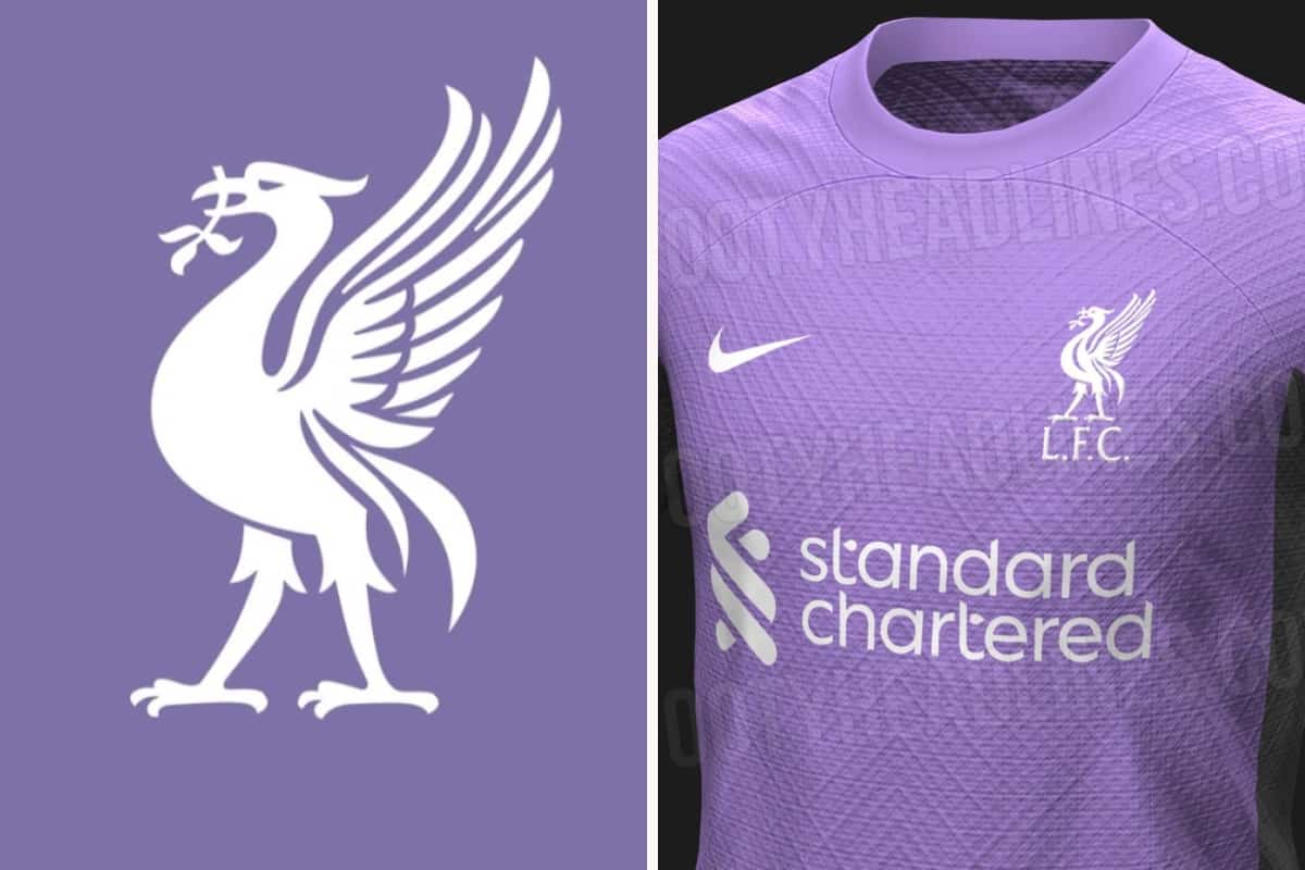
In what is a rarity for Liverpool kits, Nike looks to have opted for purple as the main colour, with further accents in a dark grey shade.
The final result makes for a fresh and creative look that earned the praise of fans online.
As far as Liverpool leaks go, that’s 2 down, with the only outlier being next season’s away kit.
A definite leak hasn’t popped up on our radar yet, but that doesn’t mean the away strip has managed to evade a leak entirely.
Instead, two separate iterations of the away kit have surfaced online, both claiming to be the real deal. And we hate to say it, but they’re both abominations.
Let’s begin with this horrid fusion of yellow and blue that Nike might have in store for Liverpool next season.
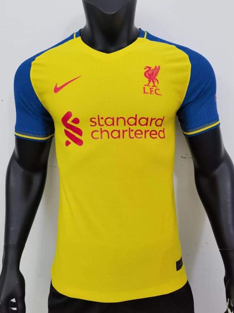
At the base is a yellow shade, with an almost navy-like blue applied on the sleeves and around the collar.
Red is used for the accents on the kit, including the various logos and a monochrome iteration of the LFC badge.
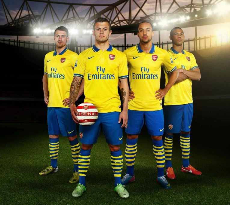
The kit screams Conference League Thursdays, it didn’t work for Arsenal back in 2013/14 and it certainly isn’t going to work here.
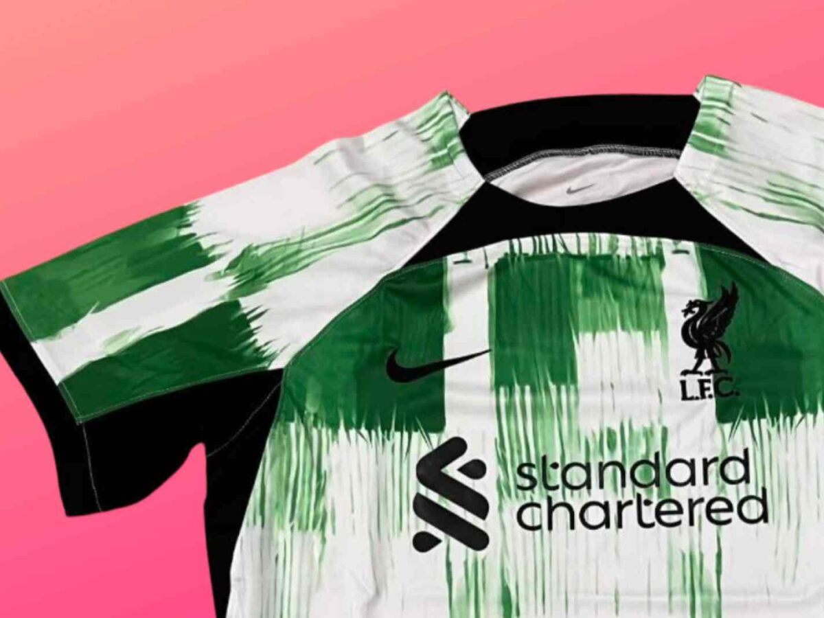
Once you’re done scrubbing your eyes off this atrocity, take a gander at…whatever this is.
The primary colours are green and white, they feature as part of an unusual graphic at the base of the kit.
The graphic itself resembles a grid or a checkered design with four white stripes running vertically across the base, while the upper and bottom sections of the grid are coloured mostly green.
There aren’t any definite sections assigned to the 2 base shades, green leaks into the white stripes and splashes of white can be seen in the primarily green areas.
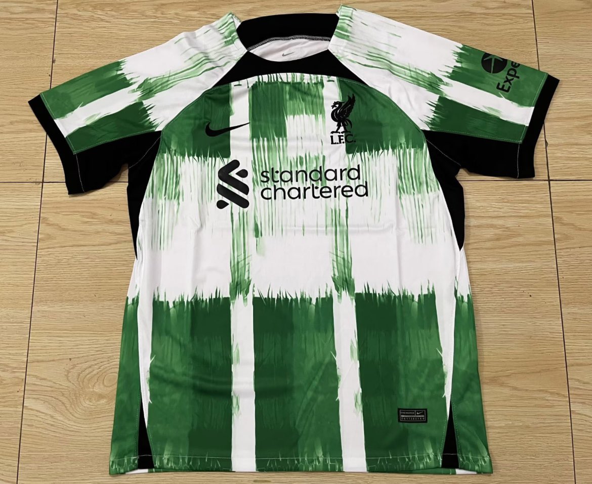
To add some balance to the havoc black is used for accents, it is also present around the sleeve and round-neck collars, and also on the inlets on either side.
The final result is a rather noisy design, there is far too much going on with little cohesion to it all.
Adding to this is the strange graphic in use, when you look at the kit, you think Celtic and certainly not Liverpool.