Hummel is one of the oldest brands in world football.
Although technically a German brand, they have strong ties with Denmark, having been their kit maker from 1979 to 2004, and then again from 2016 onwards.
They are known for having made the kits that won Denmark the 1992 European Championship, alongside other kits such as that of Real Madrid back in the 1990s and most recently, of Premier League side Everton.
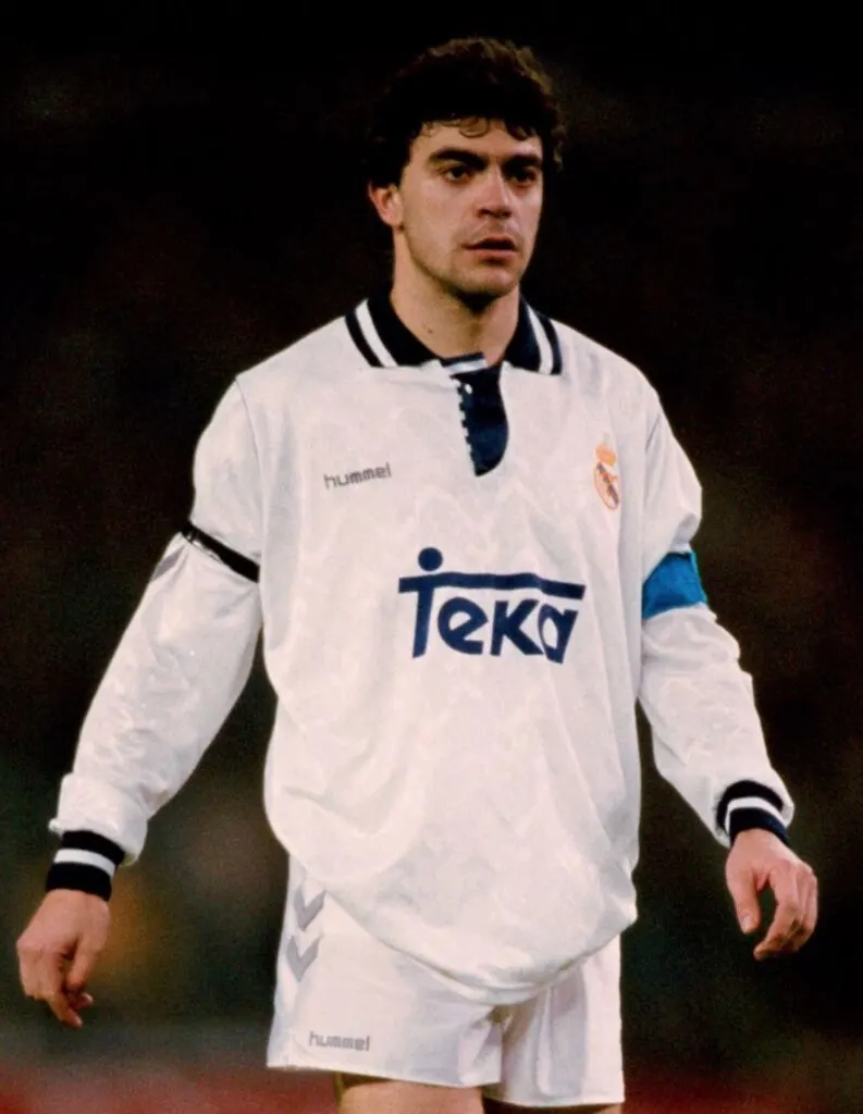
Hummel have been a form of fashion statement since these old ages, combining streetwear with football and making kits even supposedly bigger brands like Nike and Adidas would be jealous of.
With Adidas being the clear winners regarding the most beautiful kits in this year’s World Cup, and Puma and Nike disappointing, eyes were on Hummel to see what they have in store.
But we’re not quite sure what to make of Denmark’s awaited drop.
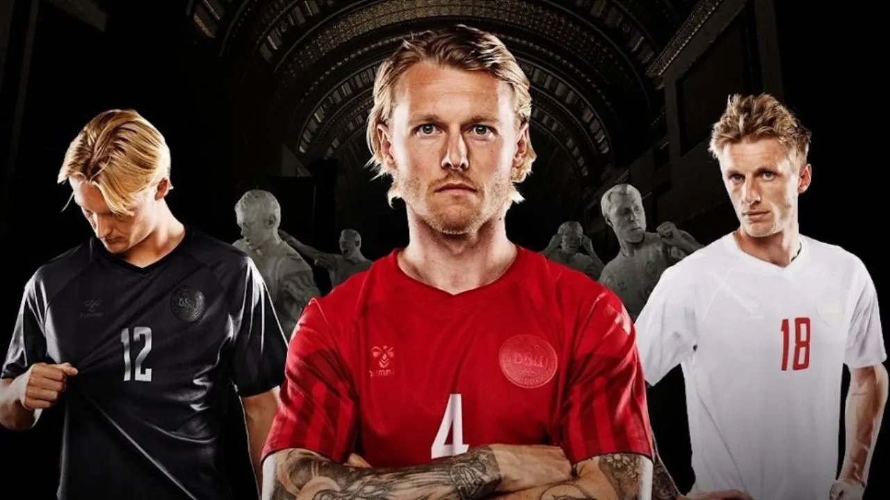
All three of Denmark’s 2022 World Cup kits have the same pattern, with different colour schemes of red, white, and black.
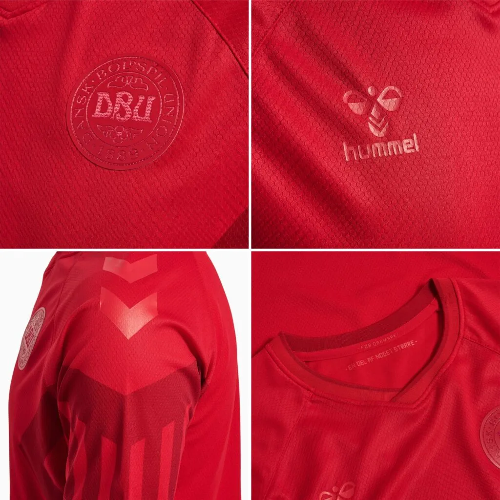
The pattern is inspired by their 1992 Euro jersey, which as mentioned before, they had won.
The kits are available for 80 Euros on the official website.
When you look at it, the kits are all rather plain.
They have a pattern of stripes on the sleeves and upper sides, which is claimed to represent the shirt from 1992.
However, the old shirt had a lot more flair and character than this dull jersey.
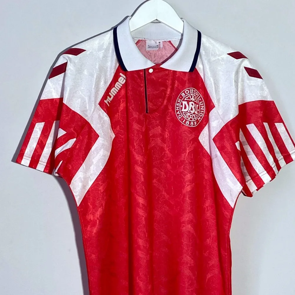
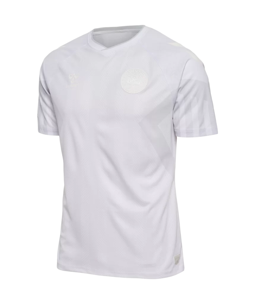
The home jersey for the Danes is a vivid red, while the away jersey is mostly white.
The trademark Hummel chevron and stripes are somewhat evident on the home shirt but are quite difficult to notice in the away kit.
It almost appears to be a completely blank canvas that has not yet been developed.
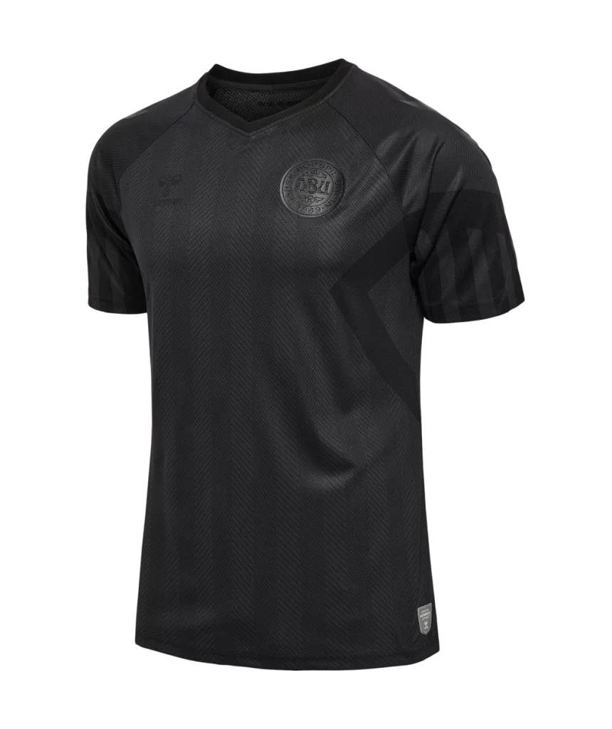
Denmark have also released a black third kit, which looks the cleanest out of all three.
However valid concerns were raised which questioned how comfortable it would be to play in an all-black kit in the hot desert of Qatar.
“For Denmark” is inscribed on the inside of the collar of the Denmark 2022 World Cup home jersey, while “En Del Af Noget Storre”, or “A Part of Something Bigger” in English, is written directly below it.
As you’d expect, Danish supporters were not the most impressed by this.
Considering this is the 30th year anniversary of their Euro win, they were expecting something with at least a little more character to it.
It’s clear to see the inspiration part is also lost on quite a few people, as it’s very hard to spot any similarities – except, well, the colour.
This feels so much lazier than any other red-out/white-out kits because Denmark had an eerily similar red-out third kit just last Euros.
So it feels like no work has been done to improve on that, rather, the kits have taken a step back.
As beautiful as plain kits might get, having these for the World Cup seems like a questionable move.
Having the country’s crest boldly visible is a choice most countries go for.
Having it hidden for aesthetic purposes is acceptable, but for all three? As we said before, we’re not quite sure.

Leave a comment
You must be logged in to post a comment.